Journal:FAIR and interactive data graphics from a scientific knowledge graph
| Full article title | FAIR and interactive data graphics from a scientific knowledge graph |
|---|---|
| Journal | Scientific Data |
| Author(s) | Deagen, Michael E.; McCusker, Jamie P.; Fateye, Tolulomo; Stouffer, Samuel; Brinson, L. Cate; McGuinness, Deborah L.; Schadler, Linda S. |
| Author affiliation(s) | University of Vermont, Rensselaer Polytechnic Institute, Duke University |
| Primary contact | Email: mdeagen at mit dot edu |
| Year published | 2022 |
| Volume and issue | 9 |
| Article # | 239 |
| DOI | 10.1038/s41597-022-01352-z |
| ISSN | 2052-4463 |
| Distribution license | Creative Commons Attribution 4.0 International |
| Website | https://www.nature.com/articles/s41597-022-01352-z |
| Download | https://www.nature.com/articles/s41597-022-01352-z.pdf (PDF) |
|
|
This article should be considered a work in progress and incomplete. Consider this article incomplete until this notice is removed. |
Abstract
Graph databases capture richly linked domain knowledge by integrating heterogeneous data and metadata into a unified representation. Here, we present the use of bespoke, interactive data graphics (e.g., bar charts, scatter plots, etc.) for visual exploration of a knowledge graph. By modeling a chart as a set of metadata that describes semantic context (SPARQL query) separately from visual context (Vega-Lite specification), we leverage the high-level, declarative nature of the SPARQL and Vega-Lite grammars to concisely specify web-based, interactive data graphics synchronized to a knowledge graph. Resources with dereferenceable uniform resource identifiers (URIs) can employ the hyperlink encoding channel or image marks in Vega-Lite to amplify the information content of a given data graphic, and published charts populate a browsable gallery of the database. We discuss design considerations that arise in relation to portability, persistence, and performance. Altogether, this pairing of SPARQL and Vega-Lite—demonstrated here in the domain of polymer nanocomposite materials science—offers an extensible approach to FAIR (findable, accessible, interoperable, reusable) scientific data visualization within a knowledge graph framework.
Keywords: FAIR, graph database, knowledge graph, materials science, research management
Introduction
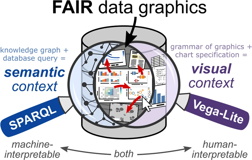
From early cartography to modern digital interfaces, data visualization—the display of abstract information in graphical form—has helped humans navigate unknown and complex spaces with a history of conceptual advancements alongside innovations in printing and reproduction. [1] Today, the widespread availability of digitized information, and the ability to process and display it with computers and web browsers, has brought interaction to the fore as a facilitator of higher-level cognitive processing on multidimensional datasets. [2] Interactive data visualization supports human reasoning and understanding through iterative exploration and investigation. [3] Given the deluge of data in many scientific domains, human-interpretable means for managing, troubleshooting, and disseminating information—particularly those that preserve machine-interpretability—remain essential in scientific research. This article illustrates such an approach, on a knowledge graph database, through the combination of a robust visualization grammar (Vega-Lite) and the query language for the semantic web (SPARQL) (Fig. 1).
|
In response to challenges around the reuse of scholarly data [4], scientific communities have mobilized around a set of four guiding principles for data management: ensuring that data is findable, accessible, interoperable, and reusable . [5] Known by the acronym FAIR, these principles aim to preserve the value of digital assets through machine-interpretable metadata standards and schema. In the materials science domain, the FAIR guiding principles have been embraced by numerous data resources and repositories, ushering in the development of modern data infrastructures for materials research. [6,7,8,9,10] The backbone and nervous system for these and other scientific data infrastructures build upon the foundation of the World Wide Web (WWW).
Since the early vision of the semantic web to make data on the internet machine-interpretable [11], the WWW has evolved from a repository of linked documents to an omnipresent medium for information exchange. The Resource Description Framework (RDF), a metadata model for the semantic web, captures knowledge through expressions known as triples, each comprising two nodes and a directional edge, that form a directed graph-based data representation inside a database, or triple store. SPARQL, a query language for RDF, uses graph-based expressions to retrieve sets of matches, or bindings, of variables in a graph pattern to content in a triple store. In the case of SELECT queries in SPARQL, sets of bindings take on a tabular form. The RDF model achieves interoperability through shared ontologies, or structured vocabularies that form the basis for capturing and reasoning over domain knowledge. Graph databases, such as knowledge graphs [12], can build on the infrastructure of the internet by using uniform resource identifiers (URIs) that follow the well-established hypertext transfer protocol (HTTP) to ensure global uniqueness. Contrary to digital object identifiers (DOIs), which represent digital resources, URIs can represent anything (e.g., physical objects, abstract concepts, etc.). However, similar to the way a DOI is accessible via redirection when “https://dx.doi.org/” is placed in front, URIs can serve representations in a process known as dereferencing, offering a way to capture information stored elsewhere on the web. Despite challenges around the implementation of truly distributed knowledge representations [13], this extensible data and metadata format shows promise as a FAIR mechanism for storing and linking scientific data.
Several tools and platforms have been developed for exploring and visualizing RDF and linked data [14,15,16,17,18,19,20,21], but a common thread in these systems is the use of a typology to define charts (e.g., bar charts, pie charts, scatter plots). Extensive research in data visualization has illuminated the deeper structure underlying most data graphics wherein graphical primitives known as data marks (e.g., point, line, area, text) have properties that can be encoded through channels (e.g., position, color, size, opacity) by mapping data attributes along discrete or continuous scales. [22,23] This grammar of graphics forms the basis for highly-cited and widely-adopted visualization libraries. [24,25] Reactive Vega [26], and later Vega-Lite [27], extended this grammar to interaction. In the Vega-Lite grammar for interactive graphics, a chart specification (written in JSON syntax) defines the visual representation of a tabular dataset (e.g., marks, encodings, selection parameters), while lower-level details (e.g., color schemes, legends, axis scales, event handlers) compile with default values unless overridden in the specification. The result is a concise, declarative specification of an interactive view of a dataset, built and customized incrementally.
Interactive methods for querying databases, such as Polaris and later VizQL (Tableau) [28,29], offer platforms for authoring interactive charts and dashboards through drag-and-drop interfaces. These systems have provided significant value to business analytics with their ease of use and suitability for many common tasks, but they are restrictive in terms of their proprietary nature, limited expressivity, and lack of support for graph-based data sources. To counter these drawbacks and provide a means for FAIR scientific data visualization, we focus our efforts on use of available open-source tools, a high degree of expressivity, and compatibility with knowledge graphs.
In this article, we describe a paradigm wherein charts defined through metadata provide a mechanism for exploring and documenting the contents of a knowledge graph of materials science data. Building on the concept of a visualization as a function of a data storage medium and a user specification [30], we model a chart as a combination of query (SPARQL) and chart specification (Vega-Lite) stored in the knowledge graph and processed on demand. This approach for bespoke, interactive data graphics is made possible by the high-level, declarative nature of SPARQL and Vega-Lite. Storing charts as metadata enables them to display the most up-to-date information in the knowledge graph, and charts themselves can be queried and analyzed. We find that dereferenceable URIs—HTTP identifiers that serve human-readable representations when opened in a web browser—embody the complementarity of SPARQL and Vega-Lite. Examples presented here draw from a knowledge graph in the materials science domain, but the paradigm applies to other domains as a mechanism for FAIR scientific data visualization and interaction.
Results
By exploring the notion of charts as metadata, we find that the variety of bespoke data graphics offers a useful, interoperable platform for exploratory visualization of a knowledge graph.
Sandbox for exploratory visualization, infographics, and meta-analyses
To address the trade-off between usability and expressivity, we opt for maximal expressivity in terms of content creation, taking usability into account by making all examples open-source and readily available for re-use. For example, domain experts without fluency in query or visualization languages (e.g., SPARQL, Vega-Lite) can interact with data in the knowledge graph by browsing a gallery of interactive charts, and those interested in creating their own charts have the code behind each chart as a precursor to adapt or modify for their own purposes. In this way, the collection of example queries and chart specifications provides a form of reusable documentation for accessing and viewing data in the knowledge graph.
To demonstrate the concept of charts as metadata, we extended the visualization capabilities of the open-source MaterialsMine repository to accommodate the saving and processing of these bespoke data graphics. The knowledge graph at MaterialsMine, previously NanoMine [8,31], contains curated data from research articles on polymer-matrix nanocomposite materials in the scholarly literature along with metadata describing the materials, processing, characterization, and bibliographic information from those articles. Structured as linked data conforming to semantic web ontologies and vocabularies [32], data and metadata are made accessible through a SPARQL endpoint on the web.
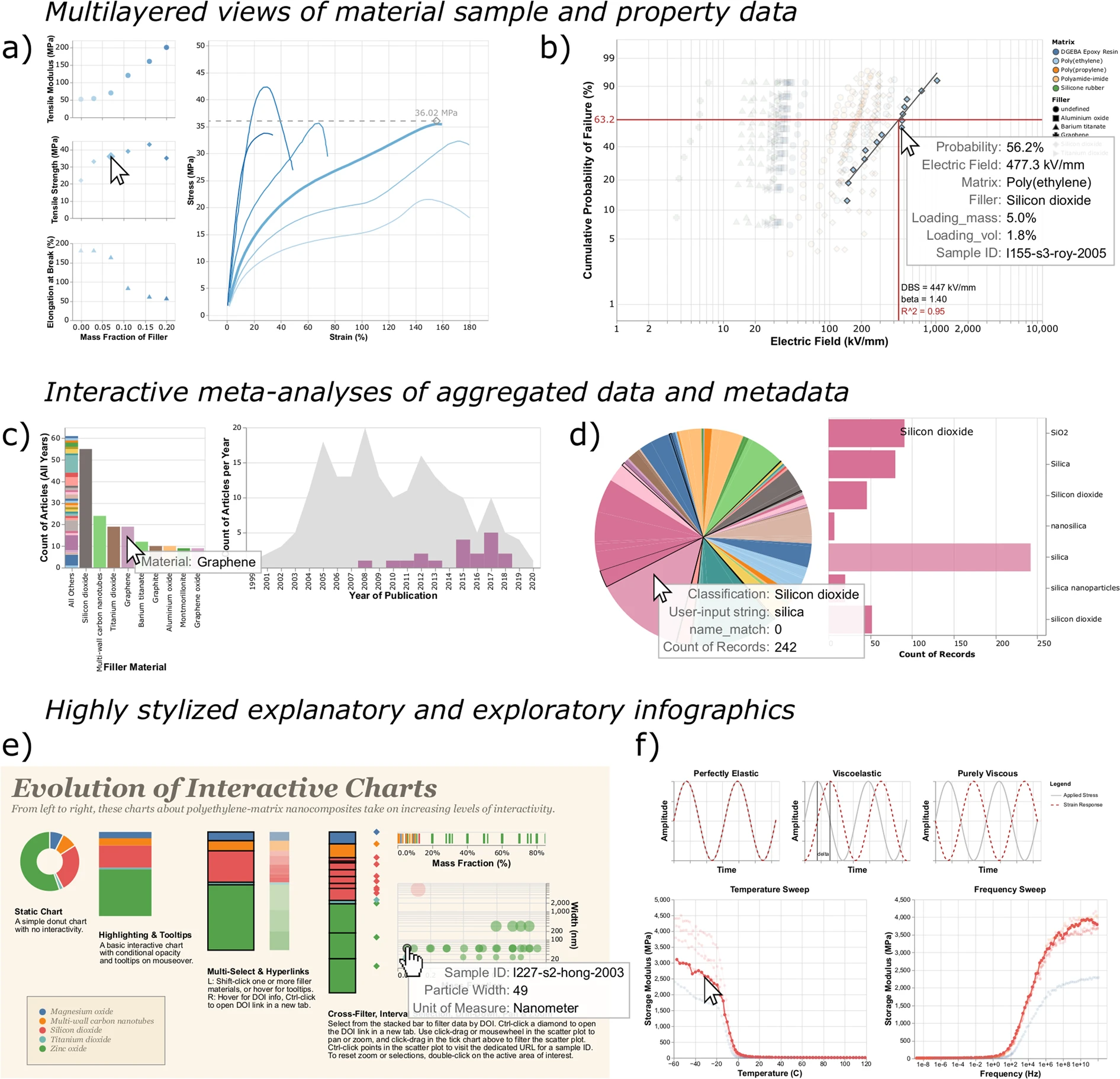
Tailored interactive charts containing data from the knowledge graph range in purpose and complexity. Depending on the SPARQL query, datasets vary from individual sample data linked to a research article to meta-analyses of all articles curated into the knowledge graph (Fig. 1). All examples shown here use some combination of layered and concatenated views combined with selections in Vega-Lite to provide explorable, interactive views of data. Following the mantra of overview first, zoom and filter, then details-on-demand [33], these data graphics use elements of interactivity to display aspects of a dataset that exceed the capability of a static representation. Common modes of interaction include tooltips, conditional display on hover interactions or selections, cross-filtered views, and pan and zoom.
Offering the full expressivity of SPARQL and Vega-Lite for specifying charts resulted in a number of interesting and often unanticipated interactive views of data in the knowledge graph. For example, rule marks with conditional opacity enable the overlaying of derived mechanical properties (e.g., tensile modulus, tensile strength, elongation at break) over representative curves showing raw tensile test data (Fig. 2a). Using Vega-Lite transforms and layered rule marks permits the custom scaling and plotting of linearized Weibull distributions for real-time calculation of dielectric breakdown strength (Fig. 2b). A query of articles and the material systems studied within them offers an interactive view of trends in polymer nanocomposite materials research (Fig. 2c). Another meta-analysis demonstrates the results of entity resolution with the ChemProps API (Fig. 2d). [34] Concatenated sub-views and text formatting parameters result in a stylized infographic demonstrating some of the ways to enhance data exploration by adding interactive elements (Fig. 2e). In addition to concatenated sub-views, sequence generators and Vega-Lite transforms make possible an embedded explanation of dynamic mechanical analysis for viscoelastic material properties atop experimental data (Fig. 2f). These and over 150 other examples currently populate the gallery of charts in the MaterialsMine knowledge graph.
|
The examples presented here by no means represent the only way to query and display these data. By making available the expressivity offered by SPARQL and Vega-Lite, we encourage experimentation and rich customization in the pursuit of effective means of data exploration for a variety of applications. Any individual data visualization will have finite applicability. However, the collection of such open-source visualizations enabled by this approach can accomplish a variety of tasks and illuminate remote corners of a knowledge graph.
Leveraging dereferenceable URIs in a knowledge graph
To avoid naming collisions, knowledge graphs employ URIs to globally identify resources without ambiguity. Using well-established internet protocols (e.g., HTTP) helps to ensure global uniqueness among distributed systems on the semantic web. A helpful practice for documenting resources involves the owner of a domain having a representation delivered by a server (e.g., HTML page) when a URI is requested through internet protocols. URIs can exist solely as identifiers, but those with available representations on the web are known as dereferenceable URIs.
References
Notes
This presentation is faithful to the original, with only a few minor changes to presentation, though grammar and word usage was substantially updated for improved readability. In some cases important information was missing from the references, and that information was added.
