Journal:Visualizing the quality of partially accruing data for use in decision making
| Full article title | Visualizing the quality of partially accruing data for use in decision making |
|---|---|
| Journal | Online Journal of Public Health Informatics |
| Author(s) | Eaton, Julia; Painter, Ian; Olson, Donald; Lober, William |
| Author affiliation(s) |
University of Washington - Seattle, University of Washington - Tacoma, New York City Department of Health and Mental Hygiene |
| Primary contact | Email: Unknown |
| Year published | 2015 |
| Volume and issue | 7(3) |
| Page(s) | e226 |
| DOI | 10.5210/ojphi.v7i3.6096 |
| ISSN | 1947-2579 |
| Distribution license | Creative Commons Attribution-NonCommercial 3.0 Unported |
| Website | http://ojphi.org/ojs/index.php/ojphi/article/view/6096 |
| Download | http://ojphi.org/ojs/index.php/ojphi/article/download/6096/5181 (PDF) |
Abstract
Secondary use of clinical health data for near real-time public health surveillance presents challenges surrounding its utility due to data quality issues. Data used for real-time surveillance must be timely, accurate and complete if it is to be useful; if incomplete data are used for surveillance, understanding the structure of the incompleteness is necessary. Such data are commonly aggregated due to privacy concerns. The Distribute project was a near real-time influenza-like-illness (ILI) surveillance system that relied on aggregated secondary clinical health data. The goal of this work is to disseminate the data quality tools developed to gain insight into the data quality problems associated with these data. These tools apply in general to any system where aggregate data are accrued over time and were created through the end-user-as-developer paradigm. Each tool was developed during the exploratory analysis to gain insight into structural aspects of data quality. Our key finding is that data quality of partially accruing data must be studied in the context of accrual lag — the difference between the time an event occurs and the time data for that event are received, i.e. the time at which data become available to the surveillance system. Our visualization methods therefore revolve around visualizing dimensions of data quality affected by accrual lag, in particular the tradeoff between timeliness and completion, and the effects of accrual lag on accuracy. Accounting for accrual lag in partially accruing data is necessary to avoid misleading or biased conclusions about trends in indicator values and data quality.
Keywords: data quality, partially accruing data, accrual lag, data visualization, secondary-use data, realtime surveillance, incomplete data
Introduction
Clinical data that are used for real-time disease surveillance present challenges in the context of public health decision-making and such data can be of marginal utility due to data quality issues. Clinical data from health care encounters are typically aggregated into data sets and sent to the surveillance system at periodic time intervals, inherently creating a delay in the availability of the data for surveillance purposes. Data for surveillance can consist of encounter-level records or aggregate data counts. Encounter-level records can be received in real time or batched over time intervals, whereas aggregate data counts are by definition batched over time intervals. Surveillance data may be available only as aggregate counts due to individual or corporate privacy concerns, such as retail monitoring of pharmacy data[1] and school absenteeism data.[2] Other data lack sufficient individual level variability, such as bed availability data, for which the individual level is a binary measurement.[3] A further level of aggregation in surveillance systems occurs when the source data is already an aggregate summary of multiple sources, such as total number of visits during a time period within a jurisdiction. Data collected from multiple sources, each with its own processes and delays, accrues piecemeal, with inherent trade-offs between timeliness and completion. Examples of such systems include vaccine surveillance data[4], where data tend to accrue over a period of weeks, jurisdictional level syndromic surveillance data[5], where data accrue over a period of days, and over-the-counter pharmacy data[1], where data accrue over a period of hours.
In its broadest sense, data quality can be defined as the degree to which data provide utility to data consumers.[6] This encompasses both intrinsic data quality (the quality of the data in and of itself) and contextual data quality (the utility of the data for the task at hand). Intrinsic data quality typically focuses on accuracy, completeness, and timeliness. In real-time disease surveillance, individual record level data has been assessed in terms of accuracy and completeness.[7] Contextual utility for disease surveillance has been examined in terms of the relationship between timeliness and the time it takes to detect outbreaks, and the sensitivity and specificity of outbreak detection algorithms[8] or chief complaint classifiers.
Given the variety of sources of data delay, surveillance data are often timely or complete, but not both. When acting as a secondary user of data, public health practitioners may have little ability to influence the timeliness of surveillance data, which is often provided on a voluntary basis without remuneration. This leaves two options for dealing with timeliness issues: wait until sufficient time has elapsed to ensure that the data are sufficiently complete (which lessens the usefulness for real-time surveillance), or develop tools for using incomplete data. To date, few methods have been developed for using incomplete data in surveillance. One exception is safety monitoring for influenza vaccinations.[9] In vaccine safety reporting systems, lags occur between the time when a vaccine is administered, the time when a record of that vaccine is reported and the time when an adverse event is reported. Green et al.[9] use sequential analysis (data are continually re-analyzed as more become available) to assess the presence of an adverse event. The only other example of which we are aware specific to aggregate summary data for real-time surveillance is an analysis of thermometer sales data collected from multiple retail stores.[10]
The work presented in this paper was motivated by methods developed for the analysis of data sets for the Distribute project for real-time influenza-like-illness (ILI) surveillance.[5] This is particularly relevant for surveillance based on aggregate data from medical record systems in developing countries, where internet connectivity and even the availability of power is intermittent, and where systems must be explicitly designed to deal with accruing data.[11] The Distribute system was used as part of the effort to monitor the H1N1 influenza pandemic outbreak in 2009.[12] The data available in the Distribute system consisted of daily counts of Emergency Department (ED) visits within each participating jurisdiction, and the number of those visits in which patients exhibit ILI symptoms. These data were aggregated from EDs (termed “sources” here) by each jurisdiction (termed “sites” here), and subsequently sent to Distribute. Typically, different sources within a site upload the data to the site at different times—daily, weekly, or haphazardly. A primary design goal of the system was to make the process of supplying data as simple as possible, both from a technical viewpoint and a policy viewpoint.[13][14] An important feature of the resulting data is that it is partially accruing, that is, data for each time point are accrued piecemeal and become more complete over time. In addition, different sources have different accrual patterns, and accrual patterns from a single source may shift over time. The indicators of primary interest in the Distribute system are the total counts of ED visits, the ILI counts, and the derived ratio of the ILI to total counts for each site. The visualization methods presented in this paper were originally developed as part of an exploratory data analysis of the data quality characteristics of the Distribute system.[15]
The main focus of the Distribute data quality analysis was to understand the structural aspects of data quality. In the process we found that standard data visualization methods did not provide adequate insight into the underlying structural characteristics, and we developed additional visualizations to address these inadequacies, using our collective expertise in statistics, visualization, public health and medical informatics. The analysis was conducted in R (an open source statistical system) version 2.10.1.[16]. The visualization methods we developed were implemented as functions in R and these functions were developed into the R package accrued.[17] The tools developed apply in general to any system where aggregate data is accrued over time.
In this paper we utilize the notion of "accrual lag" — the time elapsed between an event and the date at which data for that event become available. We illustrate how accrual lag can be used to understand the structure of partially accruing data, and in particular, demonstrate the utility of data visualizations that depict accrual lag.
Methods
Visualization methods were generated through the end-user-as-developer paradigm.[18] Methods were developed in R during the exploratory analysis to gain insight into structural aspects of data quality for individual sites. Each method was then applied across sites, and those methods that generalized to provide useful information for more than one site were formally developed into R functions and included in the accrued package using the R package development tools.[16][17] The authors served as of analysts, visualization users and developers. Data were extracted from the relational database containing the Distribute complete data store using SQL statements and stored in an R data frame. The complete data store contained a record of the aggregate emergency department ILI, gastrointestinal and total visit counts received on each date from each jurisdiction participating in Distribute. This allowed us to reconstruct what was known about aggregate counts for any particular date on each subsequent date.
Results
The key realization from this analysis was that data quality of partially accruing data must be studied in the context of accrual lag — the difference between the event time (ED visit date in the context of Distribute) and receipt time, which is the time at which the data become available to the system. Our visualization methods therefore revolve around visualizing dimensions of data quality affected by accrual lag, in particular the tradeoff between timeliness and completion, and the effects of accrual lag on accuracy.
We found three additional aspects of the data that play an important role in understanding data quality issues for partially accruing data:
- The ability to define a complete data state — an accrual lag point at which the data (and hence indicator values) can be considered complete. This state is important since without it one cannot observe a relationship between partially accruing data and complete data, nor assess the accuracy of partially accruing data.
- The presence of "record skips" — haphazard times at which no data are received. In the Distribute data this primarily occurred due to breakdowns in the data upload process.
- The presence of long-term changes in the data. We observed multiple long-term step-like changes over time in total counts received for most sites. For any particular site the mix of sources reporting to that site may change over time, resulting in these step-wise changes in the counts.
For the Distribute data, the time units are days, and “date” and “time” are used in this paper interchangeably. Due to the piecemeal accrual of data, the value of an indicator for a particular event date changes in the system until the data for that date are complete. We characterized different notions of the indicator value as follows:
- The "data-at-hand" at a particular date refers to the data that are available at that date.
- The "current value" of an indicator refers to the value of an indicator for a particular event date as of the current date, that is, the value calculated from the data-at-hand as of the current date.
- The "lagged value" of an indicator refers to the value for a particular event date a fixed number of days (the accrual lag) after that date. The number of days lagged is specified so that, for example, the five-day lagged value for an indicator for a particular date is calculated using the data-at-hand five days after that date.
- The "complete data value" of an indicator refers to the value of an indicator for a particular event date once all data for the event date have been received.
We characterize the visualizations as follows: (1) tools for understanding the relationship between event date and receipt date, (2) timeliness and completion tools, (3) constant lag tools, (4) accuracy visualizations, and (5) completeness visualizations.
(1) Tools for understanding the relationship between event date and receipt date
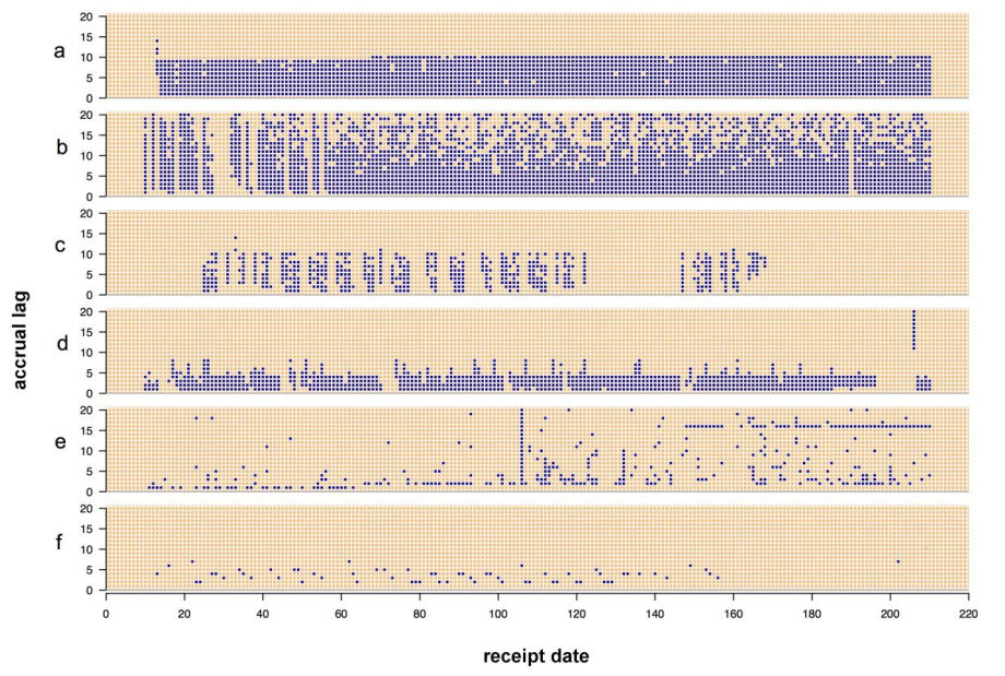
The data received on any particular date can contain data from multiple event dates. Examining the event dates contained in the data received each day allowed us to detect system failures and systematic changes in the underlying aggregation processes. We created a compact display (called a receipt pattern plot, Figure 1) to examine the receipt history for each site by generating an image plot where each value of the x-axis represents a date on which data was received, each value on the y-axis represents an accrual lag, and a point is plotted at coordinates (i,j) if the data received on day i contains any data for the date j days prior to day i. Figure 1 illustrates six canonical receipt pattern plots (a-f). These plots illustrate several features, including level of consistency and the occurrence of systematic or sporadic changes. The most consistent receipt pattern appears in the plot (a). For each of the first 70 days, data representing the nine most recent event dates were received. A subtle change occurs around day 70, after which data representing the ten most recent event dates were received each day. Plot (b) shows a site which only includes records in the data that it sends if the value for that record has changed since the last time the record was sent, or if the record has not previously been sent. This results in a pattern where after a certain lag data tends to be only received sporadically. Plot (c) shows a site where receipts occur sporadically on weekdays and almost never on weekends. Plot (d) shows a site with a fairly consistent receipt pattern until a 10-day interruption starting just before day 200. A backfill, indicating a long interval of event dates contained within the data received on a single date, occurs immediately following the interruption. Plot (e) exhibits four distinct patterns in the event dates received each day, which indicate multiple changes in the aggregation process at that site. The site in plot (f) sends data sporadically, and no records are ever received for some event dates. This site reports data from a single, very low-count source whose counts may be zero on certain days, and which uses a system that only sends data for event dates on which at least one count occurred (a similar pattern would occur if counts were suppressed when very low due to concerns that patients may be re-identified). A variation on this plot type is presented in the supplementary materials (supplementary materials Figure 7).
|
(2) Timeliness and completeness tools
To understand the relationship between accrual lag, timeliness and completeness we developed a visualization tool to examine the cumulative effect of data accrual on indicator values.
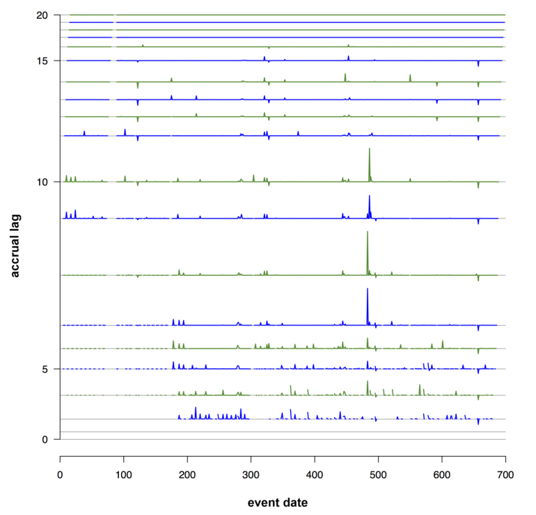
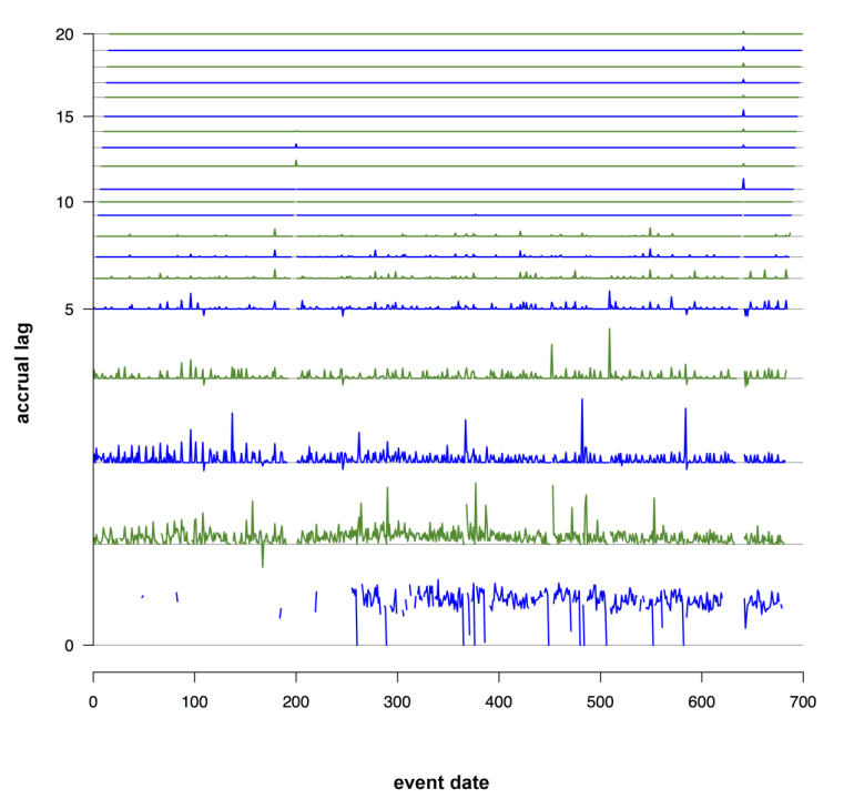
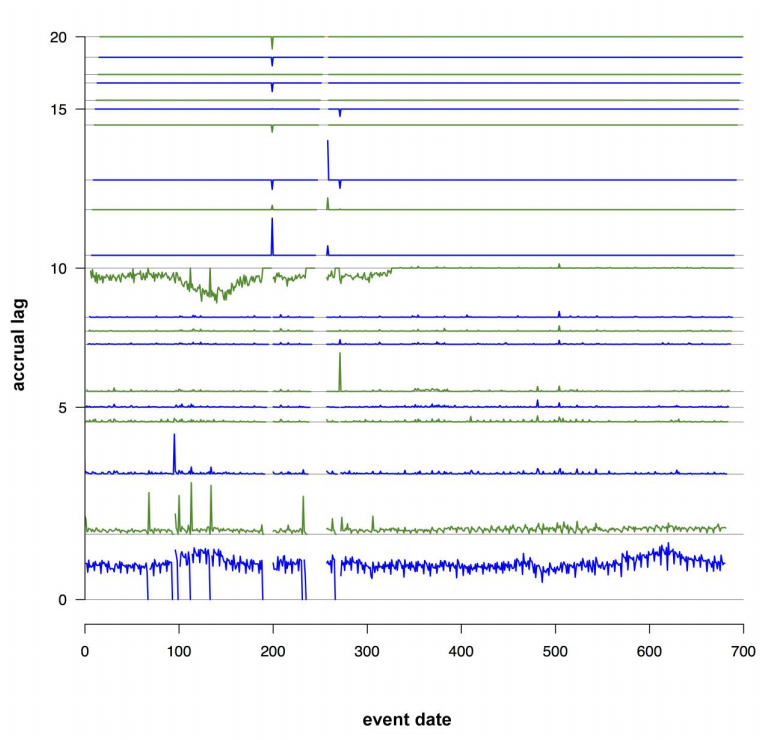
For count indicators, which will accrue cumulatively, we found that generating time series of differences of the indicator values for successive accrual lags useful. The time series lagged by s days consists of all indicator values lagged by s days, in order of event date. The time series of the sth difference was computed by subtracting the indicator value at (s-1) days from the indicator value at s days, for each event date. This process was repeated for all consecutive lags. These time series were then stacked into a single plot. We termed this plot a "stacklag difference plot." Figure 2 shows three examples of these plots (a-c). The x-axis represents the event date, and the sth layer shows the difference in count indicator values between lag s and lag (s-1), for s ≥ 1. If no counts have been received for the current or any previous lags no value is shown. The height of layer s is proportional to the maximum over x of the range of the difference in counts between lag s and lag (s-1), and a fixed gap is placed between each layer to make them distinguishable.
The stacklag difference plot provides a view of the complete history of changes in counts from lag to lag, and is useful for detecting both sporadic and systematic data quality issues. For the site shown in plot (a), a low volume of counts is regularly sent for most event dates. Just before day 500, several counts are added from lags 7 to 10, indicating that a sporadic data quality problem (underreporting for a specific event date) occurred and was subsequently corrected. In plot (b), the data appear to be nearly complete by lag 6, and few changes occur past lag 3. In plot (c), the data appear to be complete by lag 6, except for a striking change from lag 10 to lag 11, where the counts are replaced with smaller values. This pattern is systematic from the beginning of the time series until around day 300. This problem was caused by a data processing error at the data source, which was detected and corrected around day 300. This anomaly was not evident from looking at a time series plot of the data-at-hand.
|
|
|
(3) Constant lag visualization
Time series of indicator values are an obvious tool for visualizing surveillance data. Because of the accrual lag in partially accruing data, time series of current values for indicators tend to show systematic bias for recent dates. Values for count indicators in the Distribute system showed a persistent drop-off for recent dates, while for ratio indicators, site-specific current values could be systematically above, below or about the same as the complete data values for recent dates. This systematic bias makes comparing the indicators of recent dates with older dates using dataat-hand difficult and obscures not only real trends in data but trends in data quality. To avoid this issue we examined time series of indicator values with the lag held constant (so for example, a time series of the indicator values calculated from the data at hand two days after the event date). This allowed for direct examination of the effect of receipt patterns on the completeness of indicator values, and to provide a visual indicator of when data are sufficiently complete to observe trends in the data. The supplementary material includes examples of these arrayed lagged time series.
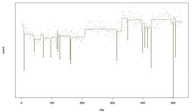
Because lagged time series do not show the persistent drop off for recent dates, they were more suited for use with anomaly detection methods than time series of the data at hand. However we found that standard CUSUM statistical process control techniques[19] for detecting anomalies in time series did not perform well for data quality detection, since data quality anomalies tended to manifest as systematic long-term changes in the data. To look for long-term changes we applied Bayesian change point detection[20][21] and found that this technique could determine both dates at which short-term data quality problems occurred and dates when long-term changes in the source makeup of a site occurred. We used the Bayesian change point estimation implemented in the bcp package[22] in R to estimate posterior means and probabilities on variance-stabilized day-of-week corrected time series of counts at specific lag values. Figure 3 shows a site with both short-term data quality issues (outliers) and longer term changes in mean counts, indicating changes in the underlying sources aggregated by the site.
|
(4) Accuracy visualizations
Understanding when data are sufficiently complete to be considered accurate is important. Accrual lag can have a major impact on the accuracy of indicator values during the accrual period; this can be characterized in terms of the degree of accuracy as a function of the accrual lag. In particular, we consider the error in an indicator value as a function of lag:
- (Indicator Error, s days lagged) = F(s day lagged indicator value, Final indicator value)
where F is an error function such as a difference or a ratio. Considering this error over all event dates in the time series, we obtain an error distribution for each lag.
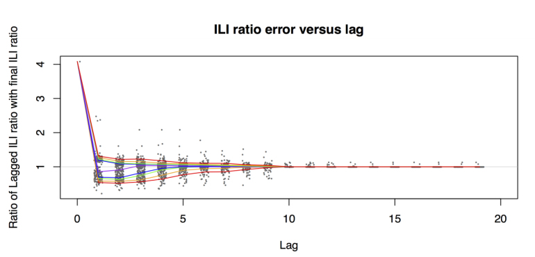
We summarize the error distribution as a function of lag by plotting fixed quantiles of the distributions for each lag, as in Figure 4, which summarizes the error distribution for the ILI ratio indicator. This plot provides a summary of both the distribution of errors for an indicator caused by accrual lag as well as any bias generated by the accrual lag. In Figure 4 the ILI ratio calculated at lag 0 is extremely inaccurate, with both high bias and high variability. The bias reduces considerably by lag 3, and the variability reduces substantially by lag 8 and is negligible by lag 10.
|
(5) Completeness visualizations
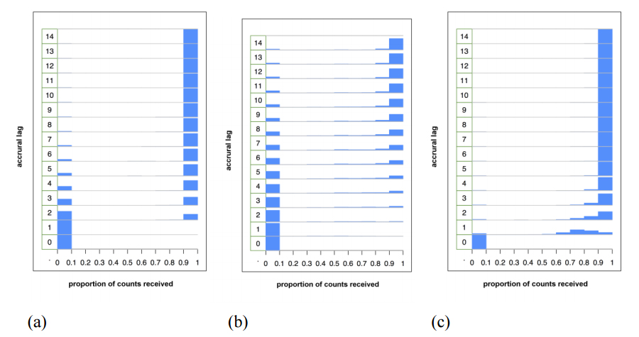
Completeness is a fundamental intrinsic data quality property. For cumulative indicators such as counts, the completeness of the data generally increases with lag. This can be summarized in terms of the average completeness of the data as a function of lag. A full description of completeness requires the examination of the distribution of completeness at each lag. To visualize this distribution we created stacked histograms of the completeness proportion according to lag (Figure 5, a-c). Plots (a) and (b) exhibit a "binary" pattern — either no data are available or all data are available, with the second site clearly less timely than the first site. This lag histogram pattern can occur when the data received either contain all or none of the data for an event date, but the lag in receiving the data is variable (this could occur for example if a site consists of a single source that sends data to the site manually on a non-regular schedule). Plot (c) shows a more gradual migration of the mass density to the right-hand side, indicative of sites with more than one contributing source.
|
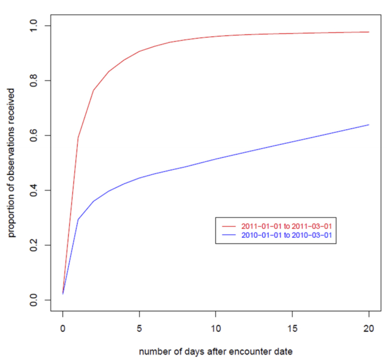
More succinct summaries of completeness can be visualized using "summary completion curves" — line plots of the mean completion versus lag. These summary plots can also be used as a tool for comparing completeness. In Figure 6, two completion curves are compared. The blue curve is the completion curve over all sites in the Distribute data for year 2010, and the red curve is the corresponding completion curve for 2011. That the red curve is higher than the blue curve for all lags demonstrates that for each lag, on average, the 2011 data were more complete than the 2010 data.
|
Discussion
The tools presented here were used for three main purposes: understanding data quality patterns, detecting data quality problems and summarizing data quality measures, with some tools useful for more than one purpose. The receipt pattern plots, stacklag difference plots, constant lag time series plots and stacked lag histograms were useful for understanding data quality patterns. For detecting data quality problems we used the receipt pattern plots, change point estimation plots, constant lag time series and stacklag difference plots. The summary completion curves were used to summarize the effects of accrual lag on completion and the accuracy visualizations were used to assess the effects of accrual lag on the accuracy of indicators.
Fundamentally, data collected for one set of consumers, such as clinical data, can be of one quality for the intended purpose, but have different data quality properties for secondary use purposes, such as public health surveillance. For example, data collected from the emergency department (ED) intake record include the chief complaint, a short free-text field containing the reason for the ED visit. Clinical decisions made solely on the basis of a chief complaint field would be problematic as the field contains little information of diagnostic value, however, on a population basis, accurate estimates of rates of syndrome occurrences can be made from tests with low sensitivity and specificity if sufficient events are available and no systematic biases are present. Systematic biases in a diagnostic test may be desirable in a clinical setting (for example in tests used in the first stage of screening) but render population-level estimates problematic. However, as long as the biases are constant over time, the data may be of sufficient quality for other population health purposes such as estimates of trends.
Difficulties are likely to occur in any secondary use setting where the downstream users have little influence on the primary data collection. For example, in principle, accrual lag can be eliminated through timely data delivery, but in practice this is difficult to achieve in settings where participation is voluntary and there is no direct control over the reporting sites. In the United States, local public health jurisdictions often conduct ED surveillance using data provided on a voluntary basis. This creates a situation where the public health jurisdiction may be reluctant to push data sources to improve the quality of the data for worry of reducing the likelihood that the source will participate in the surveillance. Thus methods to deal with data of less than perfect quality are required. This may also occur in resource-constrained settings.
Though obvious in retrospect, our key insight was the need to assess temporal patterns in the data in terms of accrual lag. When data accrue over time, data-at-hand for earlier dates are fundamentally different than data-at-hand for very recent dates. Data aberration detection algorithms that assume the data-at-hand are complete for recent dates will not perform well when applied to partially accruing data, and evaluations of these algorithms conducted under this assumption will be misleading.
Given that indicator values for data-at-hand for recent dates may differ fundamentally from indicator values for earlier dates, simple time series displays of the data-at-hand can be misleading. Clarifying the relationship between accrual lag and the error distribution can mitigate this. One approach is to use the error distribution to determine how long a delay must be for data to reach sufficient accuracy, which can be defined statistically in terms of the mean square error of the indicator, or in terms of the probability of having an error greater than some threshold. A second approach, explored by Painter et al.[23], is to calculate uncertainty measures from the error distributions, such as prediction intervals for the current value of an indicator, as a function of lag. This approach has the advantage that covariates can be incorporated in the prediction so that the uncertainty will be larger when the data are noisier. Another advantage is that, rather than not displaying data until a sufficient delay, the prediction bounds can be directly displayed on a time series graph, allowing the user to see all of the data-at-hand and a measure of confidence of the quality of the data.
Limitations
An important limitation of this work is that we did not have access to individual-level or facility-level data, and so we could not directly associate the observed patterns and changes in data quality with specific causes that may be apparent in more detailed data. Many of the visualization methods developed in this paper apply primarily to aggregate-level data; when access to more detailed data is possible, methods that make use of this level of detail would likely provide a more complete picture of the data quality patterns.
Acknowledgements
This work was supported though a subcontract from the ISDS, with original funding coming from the Markle Foundation, 2009 to 2010 (grant #101003BP-B), the Public Health Informatics Institute (PHII) and CDC, 2010-2011. Valuable feedback was received from the Distribute community throughout the project.
Financial disclosure
No financial disclosures.
Competing interests
No competing interests.
References
- ↑ 1.0 1.1 Wagner, M.M.; Tsui, F.C.; Espino, J. et al. (2004). "National Retail Data Monitor for public health surveillance". MMWR Supplements 53 (Suppl): 40–42. PMID 15714625.
- ↑ Lenaway, D.D.; Ambler, A. (1995). "Evaluation of a school-based influenza surveillance system". Public Health Reports 110 (3): 333-7. PMC PMC1382129. PMID 7610226. https://www.ncbi.nlm.nih.gov/pmc/articles/PMC1382129.
- ↑ Rolka, H.; O'Connor, J.C.; Walker, D. (2008). "Public Health Information Fusion for Situation Awareness". In Zeng, D.; Chen, H.; Rolka, H.; Lober, B.. Biosurveillance and Biosecurity. Springer Berlin Heidelberg. pp. 1–9. doi:10.1007/978-3-540-89746-0_1. ISBN 9783540897460.
- ↑ DeStefano, F.; Vaccine Safety Datalink Research Group (2001). "The Vaccine Safety Datalink project". Pharmacoepidemiology and Drug Safety 10 (5): 403–6. doi:10.1002/pds.613. PMID 11802585.
- ↑ 5.0 5.1 Olson, D.R.; Paladini, M.; Lober, W.B. (2011). "Applying a New Model for Sharing Population Health Data to National Syndromic Influenza Surveillance: DiSTRIBuTE Project Proof of Concept, 2006 to 2009". PLoS Currents Influenza. doi:10.1371/currents.RRN1251. PMC PMC3148528. PMID 21894257. https://www.ncbi.nlm.nih.gov/pmc/articles/PMC3148528.
- ↑ Wang, R.Y.; Strong, D.M. (1996). "Beyond accuracy: What data quality means to data consumers". Journal of Management Information Systems 12 (4): 5–33. doi:10.1080/07421222.1996.11518099.
- ↑ Baer, A. (2011). "An information visualization approach to improving data quality". Emerging Health Threats Journal 4: 10. doi:10.3402/ehtj.v4i0.11014.
- ↑ Jackson, M.L.; Baer, A.; Painter, I.; Duchin, J. (2007). "A simulation study comparing aberration detection algorithms for syndromic surveillance". BMC Medical Informatics and Decision Making 7: 6. doi:10.1186/1472-6947-7-6. PMC PMC1821319. PMID 17331250. https://www.ncbi.nlm.nih.gov/pmc/articles/PMC1821319.
- ↑ 9.0 9.1 Greene, S.K.; Kulldorff, M.; Yin, R. et al. (2011). "Near real-time vaccine safety surveillance with partially accrued data". Pharmacoepidemiology and Drug Safety 20 (6): 583-90. doi:10.1002/pds.2133. PMID 21538670.
- ↑ Um, N.; Visweswaran, S.; Espino, J.; Wagner, M. (2011). "Data quality in federated disease surveillance: Using variability as an indicator of quality". Emerging Health Threats Journal 4: s55. doi:10.3134/ehtj.10.055.
- ↑ Matheson, A.I.; Baseman, J.G.; Wagner, S.H. et al. (2012). "Implementation and expansion of an electronic medical record for HIV care and treatment in Haiti: An assessment of system use and the impact of large-scale disruptions". International Journal of Medical Informatics 81 (4): 244–56. doi:10.1016/j.ijmedinf.2012.01.011. PMID 22361158.
- ↑ Hiller, K.M.; Stoneking, L.; Mina, A.; Rhodes, S.M. (2013). "Syndromic surveillance for influenza in the emergency department - A systematic review". PLoS One 8 (9): e73832. doi:10.1371/journal.pone.0073832.
- ↑ Reeder, B.; Revere, D.; Olson, D.R.; Lober, W.B. (2011). "Perceived usefulness of a distributed community-based syndromic surveillance system: A pilot qualitative evaluation study". BMC Research Notes 4: 187. doi:10.1186/1756-0500-4-187. PMC PMC3146436. PMID 21672242. https://www.ncbi.nlm.nih.gov/pmc/articles/PMC3146436.
- ↑ Lober, W.B.; Reeder, B.; Painter, J. et al. (2014). "Technical Description of the Distribute Project: A Community-based Syndromic Surveillance System Implementation". Online Journal of Public Health Informatics 5 (3): 224. doi:10.5210/ojphi.v5i3.4938. PMC PMC3959914. PMID 24678377. https://www.ncbi.nlm.nih.gov/pmc/articles/PMC3959914.
- ↑ Painter, I.; Eaton, J.; Olson, D.; Revere, D.; Lober, W. (2011). "How good is your data?". Emerging Health Threats Journal 4: 142. doi:10.3402/ehtj.v4i0.11142.
- ↑ 16.0 16.1 R Core Team (2014). "R: A language and environment for statistical computing". R Foundation for Statistical Computing. http://www.r-project.org/. Retrieved 2015.
- ↑ 17.0 17.1 Eaton, J.; Painter, I. (2013). "accrued: Data Quality Visualization Tools for Partially Accruing Data" (PDF). Wirtschaftsuniversität Wien. https://cran.r-project.org/web/packages/accrued/accrued.pdf. Retrieved 2015.
- ↑ Pantazos, K.; Lausesen, S.; Vatrapu, R. (2013). "End-User Development of Information Visualization". In Dittrich, Y.; Burnett, M.; Mørch, A.; Redmiles, D.. End-User Development. Springer Berlin Heidelberg. pp. 104–119. doi:10.1007/978-3-642-38706-7_9. ISBN 9783642387067.
- ↑ Stoto, M.A.; Fricker Jr., R.D.; Jain, A. et al. (2006). "Evaluating Statistical Methods for Syndromic Surveillance". In Wilson, A.G.; Wilson, G.D.; Olwell, D.H.. Statistical Methods in Counterterrorism. Springer New York. pp. 141–172. doi:10.1007/0-387-35209-0_9. ISBN 9780387352091.
- ↑ Barry, D.; Hartigan, J.A. (1993). "A Bayesian Analysis for Change Point Problems". Journal of the American Statistical Association 88 (421): 309–319. doi:10.2307/2290726.
- ↑ Kass-Hout, T.A.; Xu, Z.; McMurray, P. et al. (2012). "Application of change point analysis to daily influenza-like illness emergency department visits". JAMIA 19 (6): 1075–81. doi:10.1136/amiajnl-2011-000793. PMC PMC3534458. PMID 22759619. https://www.ncbi.nlm.nih.gov/pmc/articles/PMC3534458.
- ↑ Erdman, C.; Emerson, J.W. (2007). "bcp: An R Package for Performing a Bayesian Analysis of Change Point Problems". Journal of Statistical Software 23 (3). doi:10.18637/jss.v023.i03.
- ↑ Painter, I.; Eaton, J.; Revere, D. et al. (2011). "Generation of Prediction Intervals to Assess Data Quality in the Distribute System Using Quantile Regression". 2011 Joint Statistical Meetings Proceedings, Statistics in Defense and National Security Section: 5172–5179.
Supplementary material
Diagonal receipt pattern plot
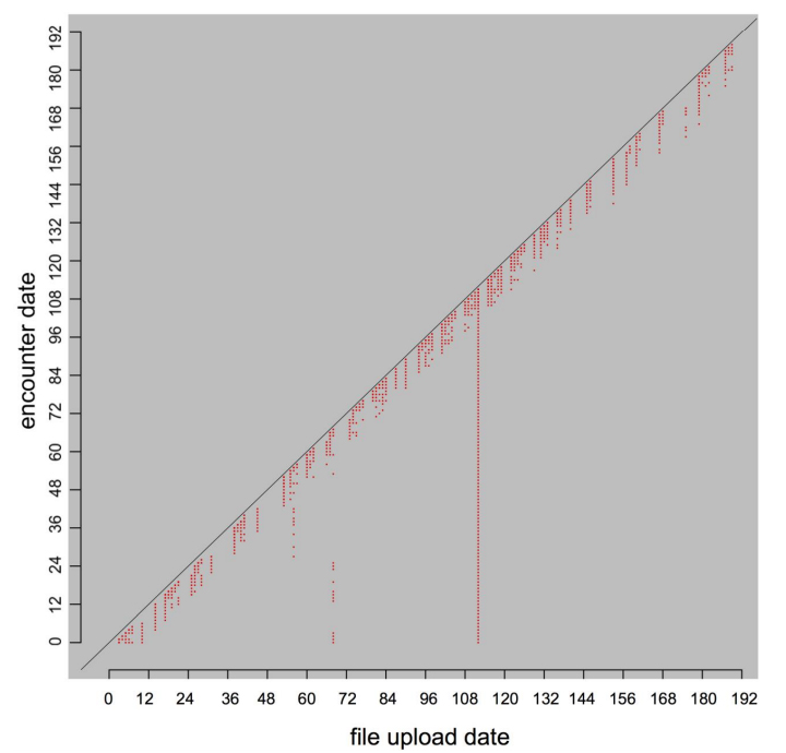
Figure 7 shows a variation on the receipt pattern plot, which shows the events dates of the data (as opposed to the lag values of the data). This creates a less compact display but allows the display of a greater period of event dates. Several important features are revealed in Figure 7; dates on which no uploads were received, dates for which no events were received and dates for which large data backfills occurred.
|
Arrayed lagged time series plots
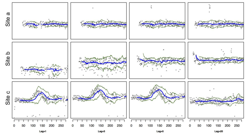
In Figure 8, arrayed lagged time series plots for three different lags show constant lag value time series for various sites with lags of 1, 3, 5 days and the complete data (lag 20) time series. The running median is shown in blue, and the MAD (Median Absolute Deviation) envelope lines are shown in green. The original time series is plotted in gray. Site (a) shows a well-behaved site that stabilizes quickly (little change between initial lags and the complete data). Site (b) shows a more typical site with the variation around the running median lines decreasing as more data become available with increasing lag. Site (c) shows an abnormality that is visible only after the data have apparently stabilized; by five days lag, little change occurs between lags up until the last day data are received from the site, at which point a large decrease in the counts occurred. While this change is clearly visible here, this change is not directly observable from any current value time series plot.
|
Bar code sparkline plots
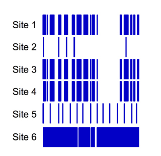
Figure 9 shows bar code sparkline plots for six sites. These plots show a vertical line for each date data are received, and provide a compact way to look at both recent and general patterns of receipt frequency. Sites 1, 3 and 4 have very similar receipt patterns. For these three sites, data were frequently but not always received, and there is a gap in the latter half of the dates. The similarity of these sites was due to a common mechanism for the data were generated. Site 5 had regular but less frequent data receipts than sites 1, 3, 4 and 6. Site 2 shows a very sparse pattern of receipts, suggesting a manual process was used, while site 6 has data recorded nearly every day.
|
Notes
This presentation is faithful to the original, with only a few minor changes to presentation. In some cases important information was missing from the references, and that information was added. The last reference had no reference text, thus "explored in [23]" was changed to "explored by Painter et al.[23]". Finally, the original had the last portion of supplementary material erroneously labeled as "Figure 8," and this representation updates it correctly to "Figure 9."
