Journal:An automated dashboard to improve laboratory COVID-19 diagnostics management
| Full article title | An automated dashboard to improve laboratory COVID-19 diagnostics management |
|---|---|
| Journal | Frontiers in Digital Health |
| Author(s) | Maury, Emma; Boldi, Marc-Olivier; Greub, Gilbert; Chavez, Valérie; Jaton, Katia; Opota, Onya |
| Author affiliation(s) | University of Lausanne, Lausanne University Hospital |
| Primary contact | Email: onya dot opota at chuv dot ch |
| Editors | Hochheiser, Harry |
| Year published | 2021 |
| Volume and issue | 3 |
| Article # | 773986 |
| DOI | 10.3389/fdgth.2021.773986 |
| ISSN | 2673-253X |
| Distribution license | Creative Commons Attribution 4.0 International |
| Website | https://www.frontiersin.org/articles/10.3389/fdgth.2021.773986/full |
| Download | https://www.frontiersin.org/articles/10.3389/fdgth.2021.773986/pdf (PDF) |
Abstract
Background: In response to the COVID-19 pandemic, our microbial diagnostic laboratory located in a university hospital has implemented several distinct SARS-CoV-2 reverse transcription polymerase chain reaction (RT-PCR) systems in a very short time. More than 148,000 tests have been performed over 12 months, which represents about 405 tests per day, with peaks to more than 1,500 tests per days during the second wave. This was only possible thanks to automation and digitalization, to allow high-throughput, acceptable time to results and to maintain test reliability. An automated dashboard was developed to give access to key performance indicators (KPIs) to improve laboratory operational management.
Methods: RT-PCR data extraction of four respiratory viruses—SARS-CoV-2, influenza A and B, and RSV—from our laboratory information system (LIS) was automated. This included age, gender, test result, RT-PCR instrument, sample type, reception time, requester, hospitalization status, etc. Important KPIs were identified and the visualization was achieved using an in-house dashboard based on the R open-source language (R Shiny).
Results: The dashboard is organized into three main parts. The “Filter” page presents all the KPIs, divided into five sections: (i) general and gender-related indicators, (ii) number of tests and positivity rate, (iii) cycle threshold and viral load, (iv) test durations, and (v) not valid results. Filtering allows to select a given period, a dedicated instrument, a given specimen, an age range, or a requester. The “Comparison” page allows custom charting of all the available variables, which represents more than 182 combinations. The “Data” page gives the user access to the raw data in a tabular format, with the possibility of filtering, allowing for a deeper analysis and data download. Information is updated every four hours.
Conclusions: By giving rapid access to a huge number of up-to-date data points, represented using the most relevant visualization types without the burden of timely data extraction and analysis, the dashboard represents a reliable and user-friendly tool for operational laboratory management, improving the decision-making process, resource planning, and quality management.
Keywords: COVID-19, medical microbiology, dashboard, digitalization, operations management, quality management, key performance indicator
Introduction
In December 2019, a new virus causing pneumonia of unknown etiology emerged in China. Its incidence exploded rapidly, first in the Wuhan region (Hubei province), then in the other regions of China and other countries in Southeast Asia. On January 30, 2020, the World Health Organization (WHO) declared this new coronavirus a “public health emergency of international concern.”[1] On the February 20, the first patient was diagnosed in Italy, in the Lombardy region. The epidemic then spread to other European countries, including Switzerland[2], and the first case was admitted to Lausanne University Hospital on February 28. On March 11, 2020 the WHO declared a pandemic, referring to the disease as Coronavirus disease 2019 or COVID-19.[3][4][5]
To face the COVID-19 pandemic, caused by the virus severe acute respiratory syndrome coronavirus 2 (SARS-CoV-2), diagnostic laboratories had to develop reverse transcription polymerase chain reaction (RT-PCR) tests allowing the detection of SARS-CoV-2 RNA in patients suspected of contracting COVID-19. Our laboratory, the Institute of Microbiology (IMU), located in one of the five teaching hospitals of Switzerland, the Lausanne University Hospital (CHUV), rapidly developed RT-PCR to detect SARS-CoV-2 in clinical specimens.[6] Microbiological diagnosis of SARS-CoV-2 represents one of the pillars of the diagnosis of COVID-19. Indeed, RT-PCR is also the heart of the patient care and epidemic control process and will be the mainstay of several clinical studies.
Although our laboratory has extensive experience in the development of RT-PCR, the introduction of this new parameter represented a challenge in terms of speed of development.[7] It is also the first time that an introduced parameter has been used on such a large scale in such a short time; more than 10,000 tests were carried out in one month in the spring of 2020[6], and even in a single week during the fall of 2020. This was possible thanks to automation and digitalization, to allow high-throughput and acceptable time to results.[7] In this context, the IMU set strategies to ensure the quality and reliability of RT-PCR. This included the monitoring of key performance indicators (KPIs) for quality management such as the proportions of positive tests or the virus load, both per day, per instruments, and per requester. These indicators aimed to identify variations not explained by epidemiological changes. Indeed, abnormal variations could be synonymous with pre-analytical problems (e.g., a sampling problem, transport medium, etc.) or even analytical problems (e.g., mutation in the target sequences of PCRs associated with losses of sensitivity or specificities). The IMU also defined KPIs for operations management, such as the turnaround time (TAT).[8]
Before COVID-19, such indicators were monitored periodically, for example in the context of an annual report or retrospective studies. At the beginning of the COVID-19 outbreak, the IMU decided to follow these indicators frequently. Because the manual analyses were time-consuming, the monitoring of analytical and operational KPIs was carried out once a week initially, and then twice a week depending on the period. These analyses were also prone to error, due to multiple sources of information, repeated manual actions (e.g., copy/cut and paste), and the diversity of the data. All this information required a dashboard.
A dashboard is a graphical user interfaces (GUI) with a database. It allows users to retrieve the relevant information—often KPIs—in a specific context by representing the data in a meaningful and usable way.[9] (See Eckerson 2010[10] for more details.) In management and business contexts, dashboards aim at turning the overwhelming information volume into an informative opportunity[11] and are part of visual analytics, defined by Cook and Thomas as the “science of analytical reasoning facilitated by interactive visual interface.”[12]
Like any other information technology in the healthcare industry, a dashboard is intended to improve efficiency.[13] Dashboards help monitor daily activities[14], such as tracking ongoing operations, a priority in healthcare institutions.[15] Providing easy access to this information helps the team to make better informed decisions[16], which could take a tremendous amount of time without the technology.[17] Correctly designed and built, dashboards improve the institution's efficiency while providing better quality of care.[18] Cheng et al.[19] offer an example of this in their study on how to build a dashboard to track respiratory viruses like influenza.
With COVID-19 spreading fast over the world, the speed at which data are gathered, integrated, and used became central in the management of this crisis by all health-related institution teams. Interactive dashboards appeared to be appropriate to this aim. A famous example remains the one from Johns Hopkins University.[20] In Switzerland, corona-data.ch[21] is an up-to-date webpage built at the macro level. With the whole healthcare industry being impacted by the pandemic, various topics and workflow areas were analyzed through dashboards, including e-consultations[22], incident command[23], and performance comparisons to similar institutions.[24]
Also, laboratories responsible for testing patients during an outbreak must control some information to ensure the highest quality of results. In particular, it is crucial to define KPIs, for example to better track daily operations[25] and ensure enough testing capacity. Moreover, when the objective is to increase capacity and quality as well as maintaining schedules, providing valuable insights and pieces of information to the laboratory management can be critical.[26]
A dashboard is an expression of a database. Therefore, as mentioned by O'Donnell and David[27], the resulting decision process depends on the information system (IS), the environment, and the user skills. Regarding the dashboard content, there is no consensus on the format of visualizations, with some researchers claiming no effect on the user's judgement[28] or stating a lack of universality in representation[29], or a preference for tabular information[30]. Wilson and Zigurs[31] showed that even the user's preferred format did not necessarily lead to greater performance, except in the case of symbolic and spatial tasks.[32] Choosing the appropriate visualization can be challenging and is subject to various principles. Lengler and Eppler[33] condensed many visualizations into a "Periodic Table of Visualization Methods," with dashboard data displayed according to three categories: boxes, tables, and plots. Each has advantages and drawbacks, the choice being made based on the end user's needs.
In this paper, we present the design, development, and use of a dashboard targeted to a laboratory such as the IMU, located in a teaching hospital and in charge of PCR testing, following the COVID-19 outbreak. This work addresses defining the need for a dashboard, building the dashboard, deploying the tool, and demonstrating its added value in terms of the quality and operations management goals set out by the laboratory. This research also focuses on aspects other than epidemiological matters (patient type, pathogen, period of the year, etc.), which can explain some variation of results in the laboratory. We split these aspects into two main categories: quality issues and management issues.
Materials and methods
RT-PCR and data
RT-PCR for the detection of SARS-CoV-2 from clinical specimens was achieved as previously described using our in-house molecular diagnostic platform (MDx platform), the Cobas SARS-CoV-2 test on the Cobas 6800 instrument (Roche, Basel, Switzerland), and the Xpert Xpress SARS-CoV-2 assay (Cepheid, CA, USA).[6][34][35] Viral load was obtained by conversion of the Ct (Cycle threshold) values of the instruments using either a plasmid containing the target sequence of the PCR obtained from RD-Biotech (Besançon, France) or using purified viral RNA, kindly provided by the Institute of Virology of the University of Berlin, la Charite.[34][35]
The dataset feeding the dashboard is an extract from Molis, a laboratory information system (LIS) used at the IMU. The extract is performed every four hours. The analyses of four respiratory virus of interest were flagged in the system: SARS CoV-2, Influenza A and B, and the respiratory syncytial virus (RSV). A comma-separated values file (csv) with new observations validated in the prior four hours is uploaded in a specific folder to be read through the dashboard.
To date, the system has 148,667 observations of SARS-CoV-2 via RT-PCR. For each specimen (swab, blood, etc.), the available entries include a unique anonymous patient ID, date of birth and gender of the patient, its hospitalization status, an anonymized code of the entity requesting the test (doctors, clinics, other laboratories, etc.), the date-time of the sampling (when available), of the test, and of the result sending as well as the type of sampling (nasopharyngeal or oropharyngeal secretions, blood sample, etc.). The original dataset also contains analysis codes showing the test result (positive, negative, canceled, NOT VALID), the Ct values, the viral quantification (in copy per milliliter, cp/mL), and whether the analysis had to be repeated. Every test is associated with various internal control tests (e.g., extraction, inhibition, etc.). “NOT VALID” results correspond to analyses which do not pass one of the internal quality controls.
A specimen is related to one patient, but a patient may be tested several times. The analysis codes correspond to a test, which is performed for a specific virus, on a specific device (machine used to perform the test), for a targeted gene.
Some cleaning and data wrangling were performed before building the dashboard. Using a matching table shared by the IMU, the analysis codes were renamed using a more user-friendly structure (NOM.VIRUS_TYPE.ANALYSE_APPAREIL_GENE). Then, different measures were extracted, especially on date-time data: the reception duration is the difference between the sampling time and the reception time at the laboratory, the test duration is the difference between the reception time and the results validation time, and the total duration is the sum of the last two. Using date of birth, patients were categorized into age groups with a 10-year window. Similarly, the type of sampling was recoded using wider groups categories, the most present being NPS (nasopharyngeal secretions). Then, each analysis is assigned a “Virus” and a “Device,” corresponding to the non-empty analysis codes described above. Another “Confirmation” variable was added, showing whether the analysis had to be repeated. Finally, four different tables were created, corresponding to each virus present in the dashboard.
Cleaning and wrangling is done automatically every time the dashboard is launched, without any action from the end-user.
Platform
The interactive dashboard was built using R Shiny[36], based on the open-source R programming language v.4.0.2[37] in the RStudio Interactive Development Environment.[38] CSS and JavaScript were also used to tailor the dashboard to the needs of the end users. The dashboard relies on many R packages:
- shinydashboard 0.7.1[39] for the page structure;
- plotly 4.9.3[40] and ggplot2 3.3.3[41] for interactive graphs;
- DT 0.17[42] for interactive tables;
- shinyjs 2.0.0[43] for some custom interaction;
- shinyWidgets 0.5.6[44] for input objects; and
- readxl 1.3.1[45], plyr 1.8.6[46], dplyr 1.0.7[47], lubridate 1.7.9.2[48], tidyr 1.1.2[49], stringr 1.4.0[50], and forcats 0.5.0[51] for data wrangling.
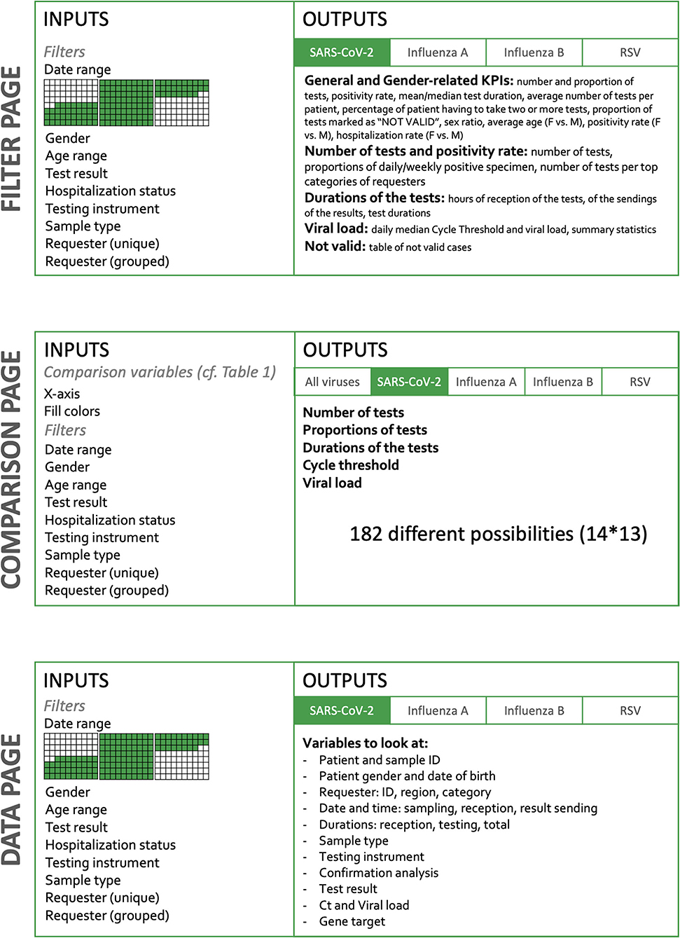
The dashboard is built in two dimensions (Figure 1). The horizontal dimension is the Target and the vertical dimension the Action. The level of detail and the amount of possibilities increase when the user goes down on the Action sections.
|
As stated above, picking the appropriate visualization can be challenging and is subject to various principles. There are three main components chosen to build the dashboard:
- Infoboxes: This type of visualization gives immediate information on some key metrics. Placed at the top of the dashboard, the user directly sees crucial information. When having several of these, it is important to group and label them appropriately.[52]
- Tables: Columns describe a specific attribute for each row, showing the user a detailed view, ready for a deeper inspection. Filtering and ordering options are available to display the portion of interest of the data.
- Plots: We used both Abela[53] and the data-to-viz.com tool created by Holtz and Healy[54], which provide clear tools to select the appropriate chart relative to the data. This dashboard mostly uses Column charts and Stacked Column charts, Scatter plots, Line charts, and Boxplots. The latter has the advantage of displaying many types of information at once, and the end users are accustomed to this format.
Finally, for a quicker adoption and an optimal usage, the dashboard was built in French, the mother tongue of the end users. The dashboard runs locally on every user's computer, in order to prevent from security issues. The data is stored on the secured CHUV's servers, accessible only when authenticated on this network. Its use is restricted to authorized staff members only, whose mission is closely linked to quality management.
Ethics
The data were obtained during a quality enhancement project at our institution. According to national law, the performance of a project and the subsequent publishing of the results can be done without asking the permission of the competent research ethics committee.
Results
Structure and main KPIs of the dashboard
Global structure of the dashboard
The content of the dashboard was guided by three main principles: comprehensive initial briefings, multiple feedback loops, and close monitoring of latest breakthrough discoveries about SARS-CoV-2. At the beginning of the process, the end users—namely the managers of the molecular diagnostic laboratory—formulated their main needs and made suggestions on what to report in the dashboard. This included the main KPIs, such as the number of tests per day as well as some of the inputs that could be entered by the user, for instance filters such as RT-PCR instruments or patients' gender or age. In an Agile-like methodology, applying continuous improvement[55], demos were regularly performed and feedback rapidly implemented. With SARS-CoV-2 being a novel virus, the scientific literature was closely scrutinized to incorporate new relevant elements, such as gender-related indicators, which were included after Ancochea et al.[56] published their research on gender bias in COVID-19 diagnosis.
The current version of the dashboard contains three main pages, detailed in Figure 1: “Filter,” “Comparison,” and “Data.” The Filter page allows the user to select inputs such as date range, gender, age, test result, hospitalization status, device used, confirmation status, type of sample, and type of requesters. On the Comparison page, the user selects variables to appear on graphs and filters the dataset to narrow down comparison subjects. Finally, the Data page also lets the user to filter the dataset to look at individual observations. Overall, the user therefore has a role in filtering observations and in deciding which information is to be represented (Figure 1).
The Filter page
The Filter page presents a total of 10 KPIs and is divided into five sections: general and gender-related indicators, number of tests and positivity rate, viral load, test durations, and “NOT VALID.”
General and gender-related indicators
The 10 KPIs are presented in aggregate form in this section, some of them being detailed in the subsequent sections. The most general figures are shown at the top of the layout and are split into two groups: "General Indicators" and "Gender-related Indicators." The General Indicators grouping has the total number of tests performed for the selected virus, the number of positive tests, the average test duration displayed next to the median duration, the average number of tests per patient, the percentage of patients having to take two or more tests, and the proportion of tests marked as “NOT VALID." The Gender-related Indicators grouping has the sex ratio (positive women out of positive men), the average age, the positivity rate, and the hospitalization rate (Supplementary Figures 1A,B).
Number of tests and positivity rate
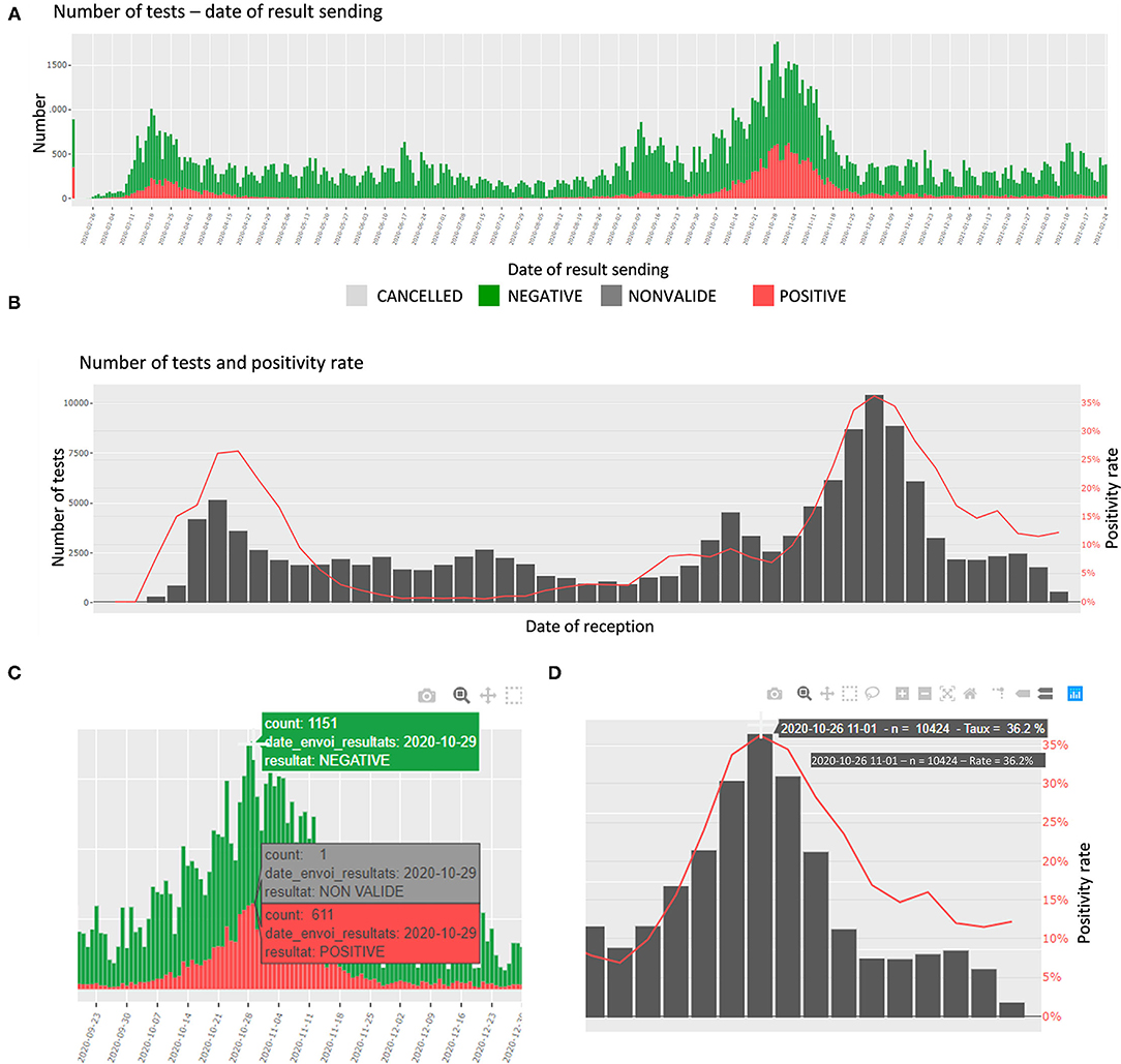
In this section, the number of tests and the proportions of daily positive specimens are detailed. The number of tests is presented per day of reception at the laboratory, per date of sending the results, and per age category. The proportions are presented per day and week of reception. In addition, an interactive table shows the number of tests per top categories of requesters. The plots are interactive to avoid cluttered visualization while allowing the user to choose the appropriate representation (zoom, labels, etc.) (Figures 2A–D).
|
Durations of the tests
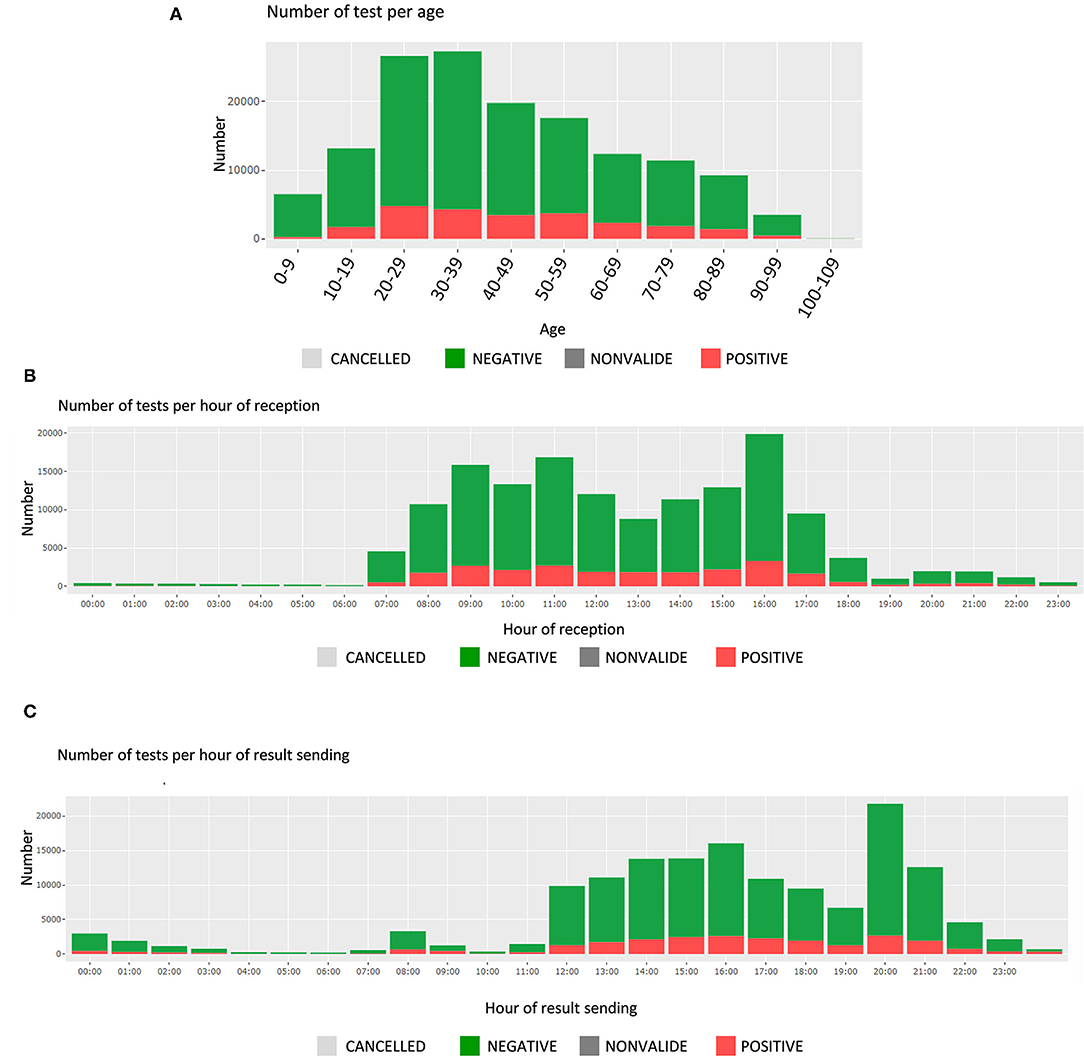
In this section, the user finds the time and date of test receipt and results sending, along with the associated test durations. These are presented by test results (positive or negative); the number of tests is displayed for each hour of a 24-hour day (Figures 3B,C). The average test durations and the average reception durations are displayed below for each reception and sending hourly period.
|
Viral load
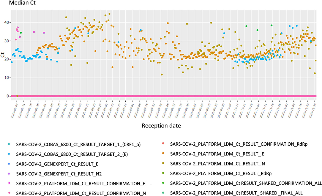
This section focuses on the viral load and cycle threshold (Ct), a KPI not presented in the first section. First, the median Ct for each day is shown, grouped by analysis (each device, each gene, each repetition); there is a total of 12 analyses (Figure 4). The viral load is also available in copy/millimeter (cp/mL) since April 9th, 2020, the date from which the laboratory started to keep this record. These are shown in a scatterplot crossed by type of sampling (blood, in nasopharyngeal secretions, etc.) as well as in a summary statistics table (Supplementary Figure 3).
|
NOT VALID
Finally, a descriptive table of the cases for which the result of the analysis was “NOT VALID” is displayed. The user can then identify any issue and investigate further. For sake of readability only some variables are shown (Supplementary Figure 4).
Comparison page
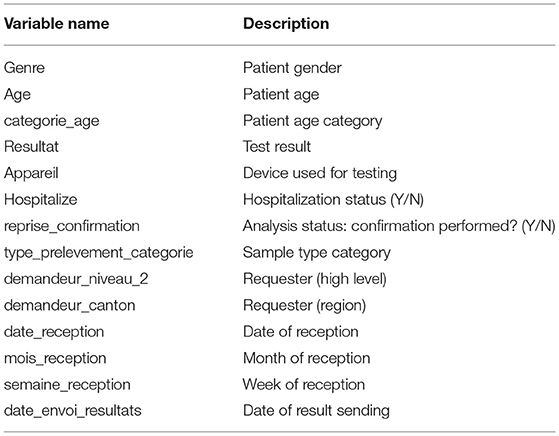
When moving to the Comparison page, the user sees first a global summary for all viruses. It shows the daily number of tests for each disease as well as the corresponding daily positivity rate. Then, like the Filter page, each virus information is shown in a specific tab. For each virus, the user can select the x-axis variable and the coloring variable. An error message is displayed when the chosen variables are the same (Table 1).
|
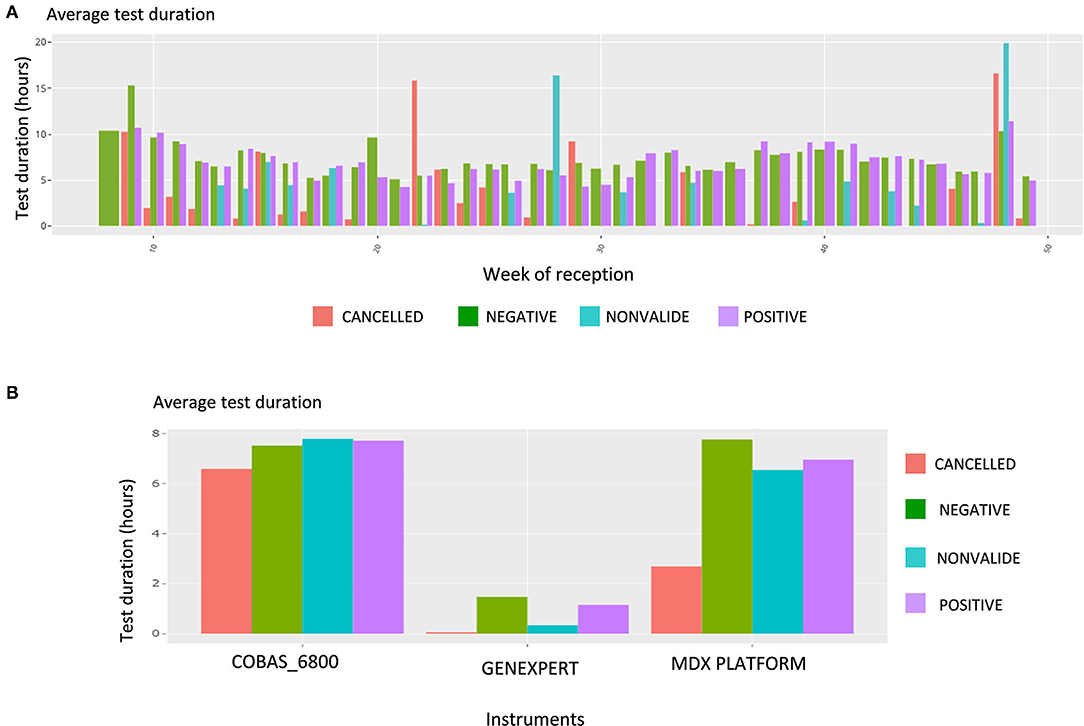
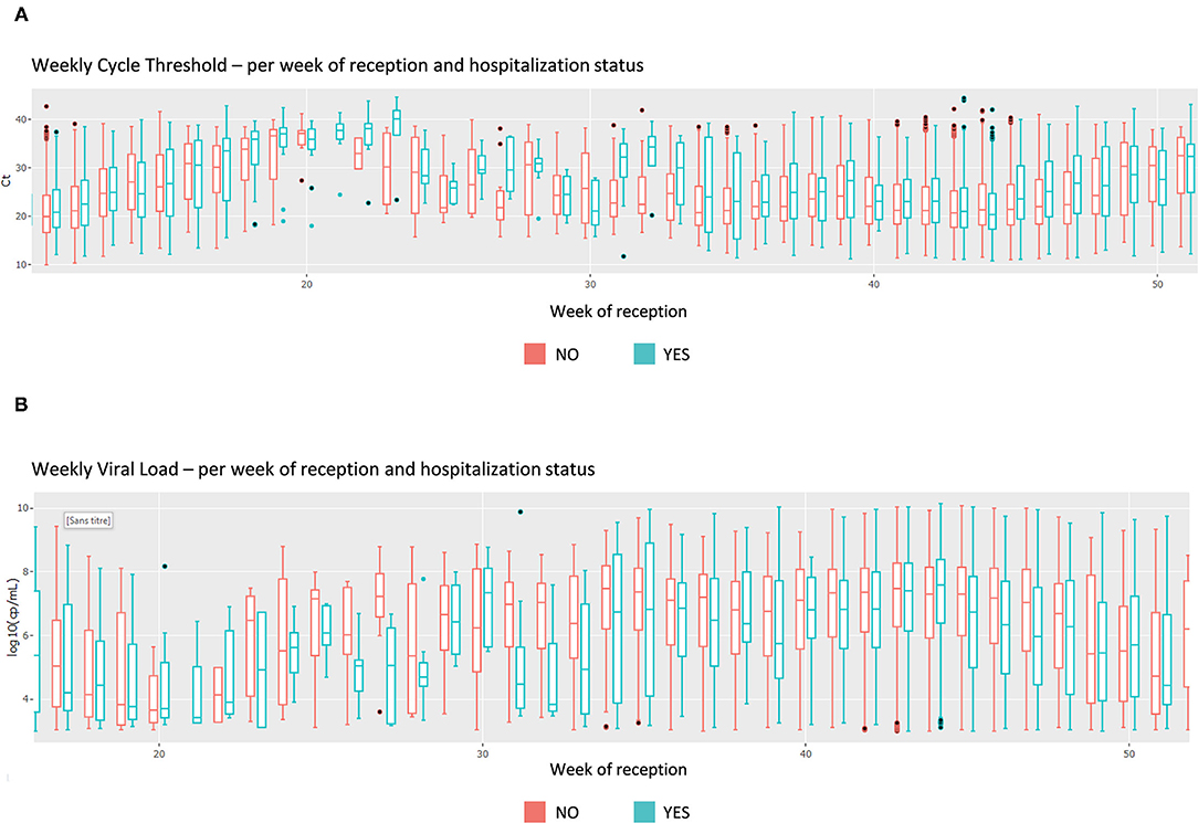
Upon this choice, the absolute and the relative number of tests are plotted, such as shown in Supplementary Figure 4 for gender and week of reception. The following plot shows data about the test duration. Figure 5 shows the average test duration per instrument, depending on the result of the test. This is especially useful to control the speed of some devices. Finally, the Ct information is displayed using boxplots (Figure 6A), a familiar representation to the end users. All the described figures are common to all viruses. For SARS-Cov-2, an additional boxplot of the viral load in log10 scale is displayed (Figure 6B). This additional boxplot appears only for this virus whose load can vary from 10,00 to 14,00,00,00,000 cp/mL. The log10 scale provides a more readable graph.
|
|
Data page
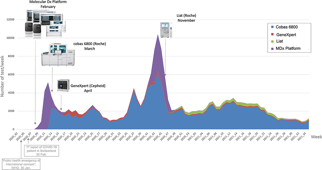
On the Data page, the users can have a look at the raw data in a table format, after filtering if wanted, thus deepening the analysis of an issue located with the previous pages tools. They can then download the data and explore it in Microsoft Excel. This simple feature appeared to be surprisingly useful to the users, who could then extract data more quickly than with a database request from Molis. As an example, Figure 7 is a graph showing weekly number of tests linked to lab events (new machines acquisition), extracted from the Data page.
|
Operational management implications
The general KPIs (e.g., number of daily tests, average number of tests per patient, etc.), such as those appearing at the very top of the dashboard area of Supplementary Figure 2A, are used to continuously reassess the current situation. Seeing the evolution of the past few days or weeks helps the staff adjust their resources, including launching some recruitment or sending back the technicians from other department, adjusting the repartition of staff among the laboratory, handling material shortage by anticipating future volumes, etc.
On a regular basis, the KPIs regarding the durations of the test allow the detection of operational issues. For instance, the dashboard led to the discovery of a huge amount of samples received at the end of the business day, and helped tune the process of deliveries at the laboratory. This is central to meet the needs of the hospital and requesters, and, at the end, the patients themselves. The tool also supports the team in charge of identifying potential causes of delay: by being able to look into various combination and level of details, it is possible to point out these causes during the whole process (from sampling, to testing, to result sending). They hence can then be investigated individually (e.g., by requester) or more globally (e.g., by day of the week). Figures 3B,C are used on a daily basis to continuously reassess this crucial aspect of timing.
The dashboard also confirmed some suspicions the institute had from its experience: it helped identify the peak hours, adapt the distribution of the employees, and make recommendation to major requesters in order to smooth the operational activity during the day. Finally, the daily tracking of these KPIs allowed the monitoring of inventoried materials and avoided an unexpected shortage of scarce test resources.
Quality management implications
Positivity rate
Having the possibility to observe the positivity rate by instrument can help diagnose any failure, such as contamination. For instance, an increase in the positivity rate could be due to a contamination of the test reagent. Easily accessing this information (as seen in Supplementary Figure 2B, for example), being able to quickly analyze it and linking it to Ct values provides a critical advantage in maintaining high-quality results over the course of the outbreak. Since the users of the dashboard can also look at the data per requester, or requester type, in case of a sudden variation in the positive rate test results, it allows them to look for non-epidemiologic reasons. Possible explanations include the change in sampling methodologies, change in patient type (e.g., from mostly children to elderly patients), and the addition of new facilities in some requester categories. They can also investigate the geographical origin of the test and share relevant information with the appropriate authorities.
Finally, being able to verify the number of positive specimens by age category is critical, as the patients' age is playing a key role in the pandemic (spreading role of children, disease evolution among elderly, etc.). Figure 3A shows the number of tests per age group, which can be filtered for specific periods of time, or different requesters.
Aside from positive and negative tests, the number of NOT VALID cases is closely monitored. As shown in Supplementary Figure 1, the proportion of NOT VALID tests is very low, which indicates high-quality analyses.
Viral load
Among various data in the dashboard, the viral load especially helps guarantee the accuracy of the test or, conversely, identify and solve analytic problems. For instance, any sudden drop or jump in the daily or weekly median viral load raised a warning and calls for explanation (e.g., change of testing strategy, population target). If no explanation is found, one could suspect a problem at the analytical stage (i.e., pre-analytical stage, virus mutation, etc.). A major viral load drop could mean a decrease in analytic sensitivity, which could be dramatic during an outbreak. A decrease in the median viral load was observed in April 2020, which led to a modification of the testing strategy, namely a universal testing strategy.[35]
Similarly, tracking the viral loads per patient type helps address the test sensitivity. Indeed, since the institute performs tests on a large variety of patients, it needs to track this measure to adjust the tests' sensitivity in real time, if relevant.
Additionally, the viral load by type of specimen (nasopharyngeal secretions, blood samples, throat secretions) helps with addressing the performance of the test in different tests of specimens.[34][57]
The viral load by instrument gives information on the analytical performance of each methods. Indeed, any drop out or increase could be the result of virus mutation or contamination.
Discussion
To respond to the COVID-19 pandemic, our laboratory had to introduce several methods to detect SARS-CoV-2 in clinical samples by RT-PCR within a short period of time. In fact, this sensitive method is reliable to control the spread of the virus by identifying infected patients, including asymptomatic subjects.[35][58] As a result, the number of RT-PCR tests performed each day increased rapidly, with an average of 350 tests per day, and peaks beyond 1,000 tests per day in Switzerland's first epidemic wave and 1,700 tests per day during the second wave.
Although the programming skills of the lab have improved, the dashboard frees the users from needing to extract the data, a long and potentially complex task which requires working with the IS team and pulling data using statistical software like R or Excel to produce the useful representation. A dashboard promises the potential gain of time and productivity in a public hospital context, where the resources are scarce and the staff is under the day-to-day task pressure. Consequently, working with the dashboard improved the functioning of the laboratory both in terms of management of operations and in terms of quality. This improvement was reflected in the reactivity and decision making resulting from the real-time interpretation of indicators. Indeed, this emerging virus posed a large number of challenges for diagnostic laboratories, which had to quickly introduce new diagnostic methods and to adapt to the challenges faced during the different stages of the pandemic.
Reliability of RT-PCR tests
The first challenge for our diagnostic laboratory was to ensure the reliability of RT-PCR assays. This was especially important because it was the first time that a test had been used with such a high throughput soon after its introduction. In this case, the statistical analyses proposed by the dashboard helped to improve the reliability of those tests. For example, the real-time monitoring of the positivity rate of the tests or of the viral load in the clinical samples enabled us to highlight analytical problems, which could lead to false positives or false negatives. Using the dashboard, the positivity rate was compared according to the different instruments to check whether one instrument might be associated with a systematic error. However, cautious interpretation of the data available through the dashboard is mandatory since differences might also be due to various other factors. For example, because highly symptomatic subjects admitted at the emergency ward of the hospital were tested with the GeneXpert rapid RT-PCR, the tests performed with that instruments were more often positive.
Management of multiple instruments and stocks
We also had to introduce several different RT-PCR methods. The goal was primarily to guarantee continuity of service in the case of instrument failure or reagent shortage[6], but also to respond to a need for faster tests, notably for analyses carried out in emergencies to avoid nosocomial infections.[35] In this context of a fleet of several RT-PCR instruments, the dashboard allows real-time monitoring of laboratory activity in terms of tests carried out on each instrument. This monitoring has enabled us, for example, to identify a risk of significant penury of the rapid molecular test. This problem was solved by quickly introducing a second test.
Turnaround time (TAT)
A challenge for the laboratory was to adapt to the needs of clinicians for the patient's care and to be useful for public health decisions. This required a quick TAT. The dashboard allowed us to dynamically monitor the time of arrival of samples at the laboratory and thus to adjust workflow and scheduling. Typically, we added human resources at the end of the afternoon to allow more same-day results.
In its current version, the code is still under development and shows several limitations. First, the dashboard code is specific to the practice of our laboratory and difficult to generalize. Secondly, its performance could be improved, given that it is slow to refresh and unlikely to support database growth on the long term.
In regards to the analytical aspects, the dashboard is a first step towards developing models that implement (i) automatic alerts (e.g., indicating when resources should be increased or decreased) using statistical process control, (ii) predictions (e.g., number of positive rates, the number of tests, etc.) using time series forecasting and exogenous information (e.g., other laboratory's data, governmental decisions, etc.), and (iii) scenario stressing (e.g., theorizing what would happen if the authorities change the sanitary restrictions). An original and interesting potential of development could be the use of multivariate forecasting techniques since the app allows users to see and extract several virus data whose correlations may be exploited.
Finally, to better evaluate the impact of such tools on laboratory management, quantitative evaluation should be performed now that the dashboard is fully used by the IMU's staff. We can expect that this type of tool will also help to consolidate the user's intuitions in the long term.
Supplementary material
The supplementary material for this article can be found online (pop-ups may need to be enabled).
- Supplementary Figure 1. Screen shots of the Filter page. (A) Number of tests and test results per date of reception. (B) Positivity rate per date of reception.
- Supplementary Figure 2. Screen shots of the Filter page. (A) Number of tests and test results per date of reception. (B) Positivity rate per date of reception.
- Supplementary Figure 3. Screen shots of the Filter page. (A) Viral load time series plot per sampling type, per date of reception and (B) descriptive statistics table. AS, anal swab; BAL, bronchoalveolar lavage; EXPECT, expectoration; NPS, nasopharyngeal swab; TS, throat swab; NA, non-applicable.
- Supplementary Figure 4. Screen shots of the Comparison page that allows 182 different combinations, focus on gender KPI. (A) Number of tests per gender, per week of reception and (B) proportion of each gender, per week of reception.
Acknowledgements
We thank all the staff of the Laboratory of Molecular Diagnostic of the Institute of Microbiology of the University of Lausanne and in particular Miss Zahera Naseri and Dr. Damien Jacot. We also thank Mr. Fabien Faverjon, Mr. Frank Hottin, and the IT and Data Team for their support.
Author contributions
EM, M-OB, GG, VC, KJ, and OO contributed substantially in the conception or design of the work and in the acquisition, analysis, or interpretation of data for the work, in the drafting of the work or revising it critically for important intellectual content, in the final approval of the version to be published, and in the agreement to be accountable for all aspects of the work in ensuring that questions related to the accuracy or integrity of any part of the work are appropriately investigated and resolved. All authors contributed to the article and approved the submitted version.
Conflict of interest
The authors declare that the research was conducted in the absence of any commercial or financial relationships that could be construed as a potential conflict of interest.
References
- ↑ World Health Organization (30 January 2020). "Statement on the second meeting of the International Health Regulations (2005) Emergency Committee regarding the outbreak of novel coronavirus (2019-nCoV)". World Health Organization. https://www.who.int/news/item/30-01-2020-statement-on-the-second-meeting-of-the-international-health-regulations-(2005)-emergency-committee-regarding-the-outbreak-of-novel-coronavirus-(2019-ncov).
- ↑ Tadini, Eliana; Papamidimitriou-Olivgeris, Matthaios; Opota, Onya; Moulin, Estelle; Lamoth, Frédéric; Manuel, Oriol; Lhopitallier, Loic; Jaton, Katia et al. (6 May 2020). "[SARS-CoV-2, a point in the storm"]. Revue Medicale Suisse 16 (692): 917–923. ISSN 1660-9379. PMID 32374537. https://pubmed.ncbi.nlm.nih.gov/32374537.
- ↑ Federal Office of Public Health (25 February 2020). "New Coronavirus 2019-nCoV: First confirmed case in Switzerland". Federal Office of Public Health. https://www.bag.admin.ch/bag/en/home/das-bag/aktuell/medienmitteilungen.msg-id-78233.html.
- ↑ World Health Organization (5 January 2020). "COVID-19 - China". World Health Organization. https://www.who.int/emergencies/disease-outbreak-news/item/2020-DON229.
- ↑ World Health Organization (13 January 2020). "WHO statement on novel coronavirus in Thailand". World Health Organization. https://www.who.int/news/item/13-01-2020-who-statement-on-novel-coronavirus-in-thailand.
- ↑ 6.0 6.1 6.2 6.3 6.4 Opota, Onya; Brouillet, René; Greub, Gilbert; Jaton, Katia (11 November 2020). "Comparison of SARS-CoV-2 RT-PCR on a high-throughput molecular diagnostic platform and the cobas SARS-CoV-2 test for the diagnostic of COVID-19 on various clinical samples" (in en). Pathogens and Disease 78 (8): ftaa061. doi:10.1093/femspd/ftaa061. ISSN 2049-632X. PMC PMC7657383. PMID 33030200. https://academic.oup.com/femspd/article/doi/10.1093/femspd/ftaa061/5919476.
- ↑ 7.0 7.1 Greub, Gilbert; Sahli, Roland; Brouillet, René; Jaton, Katia (1 March 2016). "Ten years of R&D and full automation in molecular diagnosis" (in en). Future Microbiology 11 (3): 403–425. doi:10.2217/fmb.15.152. ISSN 1746-0913. https://www.futuremedicine.com/doi/10.2217/fmb.15.152.
- ↑ 8.0 8.1 Marquis, Bastian; Opota, Onya; Jaton, Katia; Greub, Gilbert (6 May 2021). "Impact of different SARS-CoV-2 assays on laboratory turnaround time" (in en). Journal of Medical Microbiology 70 (5). doi:10.1099/jmm.0.001280. ISSN 0022-2615. PMC PMC8289200. PMID 33956591. https://www.microbiologyresearch.org/content/journal/jmm/10.1099/jmm.0.001280.
- ↑ "Dashboard (business)". Wikipedia. 2020. https://en.wikipedia.org/wiki/Dashboard_(business).
- ↑ Eckerson, W.W. (2010). "Part I The Landscape for Performance Dasboards". Performance Dashboards: Measuring, Monitoring, and Managing Your Business (2nd ed.). John Wiley & Sons. p. 4. ISBN 978-0-470-91842-5.
- ↑ Keim, Daniel; Andrienko, Gennady; Fekete, Jean-Daniel; Görg, Carsten; Kohlhammer, Jörn; Melançon, Guy (2008), Kerren, Andreas; Stasko, John T.; Fekete, Jean-Daniel et al.., eds., "Visual Analytics: Definition, Process, and Challenges" (in en), Information Visualization (Berlin, Heidelberg: Springer Berlin Heidelberg) 4950: 154–175, doi:10.1007/978-3-540-70956-5_7, ISBN 978-3-540-70955-8, http://link.springer.com/10.1007/978-3-540-70956-5_7. Retrieved 2022-02-17
- ↑ Thomas, J.J.; Cook, K.A. (2005). "Illuminating the Path: The Research and Development Agenda for Visual Analytics". Homeland Security Digital Library. United States Department of Homeland Security. https://www.hsdl.org/?view&did=485291.
- ↑ Menon, Nirup M.; Lee, Byungtae; Eldenburg, Leslie (1 March 2000). "Productivity of Information Systems in the Healthcare Industry" (in en). Information Systems Research 11 (1): 83–92. doi:10.1287/isre.11.1.83.11784. ISSN 1047-7047. http://pubsonline.informs.org/doi/abs/10.1287/isre.11.1.83.11784.
- ↑ Pestana, Miguel; Pereira, Ruben; Moro, Sérgio (1 April 2020). "Improving Health Care Management in Hospitals Through a Productivity Dashboard" (in en). Journal of Medical Systems 44 (4): 87. doi:10.1007/s10916-020-01546-1. ISSN 0148-5598. http://link.springer.com/10.1007/s10916-020-01546-1.
- ↑ Koumpouros, Yiannis (3 May 2013). "Balanced scorecard: application in the General Panarcadian Hospital of Tripolis, Greece" (in en). International Journal of Health Care Quality Assurance 26 (4): 286–307. doi:10.1108/09526861311319546. ISSN 0952-6862. https://www.emerald.com/insight/content/doi/10.1108/09526861311319546/full/html.
- ↑ Al-Hajj, S.; Pike, I.; Fisher, B. (2013). "Interactive Dashboards: Using Visual Analytics for knowledge Transfer and Decision Support" (PDF). Proceedings of the 2013 Workshop on Visual Analytics in Healthcare. https://www.cc.gatech.edu/gvu/ii/PublicHealthVis/Papers/Dashboards%20-%20Decision-Making%20Support%20for%20Health%20Informatics_F.pdf.
- ↑ Stadler, Jennifer G.; Donlon, Kipp; Siewert, Jordan D.; Franken, Tessa; Lewis, Nathaniel E. (1 June 2016). "Improving the Efficiency and Ease of Healthcare Analysis Through Use of Data Visualization Dashboards" (in en). Big Data 4 (2): 129–135. doi:10.1089/big.2015.0059. ISSN 2167-6461. http://www.liebertpub.com/doi/10.1089/big.2015.0059.
- ↑ Ward, Michael J.; Marsolo, Keith A.; Froehle, Craig M. (1 September 2014). "Applications of business analytics in healthcare" (in en). Business Horizons 57 (5): 571–582. doi:10.1016/j.bushor.2014.06.003. PMC PMC4242091. PMID 25429161. https://linkinghub.elsevier.com/retrieve/pii/S0007681314000895.
- ↑ Cheng, Calvin KY; Ip, Dennis KM; Cowling, Benjamin J; Ho, Lai Ming; Leung, Gabriel M; Lau, Eric HY (14 October 2011). "Digital Dashboard Design Using Multiple Data Streams for Disease Surveillance With Influenza Surveillance as an Example" (in en). Journal of Medical Internet Research 13 (4): e85. doi:10.2196/jmir.1658. ISSN 1438-8871. PMC PMC3222192. PMID 22001082. http://www.jmir.org/2011/4/e85/.
- ↑ Dong, Ensheng; Du, Hongru; Gardner, Lauren (1 May 2020). "An interactive web-based dashboard to track COVID-19 in real time" (in en). The Lancet Infectious Diseases 20 (5): 533–534. doi:10.1016/S1473-3099(20)30120-1. PMC PMC7159018. PMID 32087114. https://linkinghub.elsevier.com/retrieve/pii/S1473309920301201.
- ↑ Probst, Daniel (12 August 2020). "Communicating Near Real-Time Data During the COVID-19 Pandemic: Medicinal Chemistry and Chemical Biology Highlights". CHIMIA 74 (7-8): 613. doi:10.2533/chimia.2020.613. ISSN 2673-2424. https://chimia.ch/chimia/article/view/1085.
- ↑ Dixit, Ram A; Hurst, Stephen; Adams, Katharine T; Boxley, Christian; Lysen-Hendershot, Kristi; Bennett, Sonita S; Booker, Ethan; Ratwani, Raj M (1 September 2020). "Rapid development of visualization dashboards to enhance situation awareness of COVID-19 telehealth initiatives at a multihospital healthcare system" (in en). Journal of the American Medical Informatics Association 27 (9): 1456–1461. doi:10.1093/jamia/ocaa161. ISSN 1067-5027. PMC PMC7337800. PMID 32618999. https://academic.oup.com/jamia/article/27/9/1456/5866982.
- ↑ Grange, Elisha S.; Neil, Eric J.; Stoffel, Michelle; Singh, Angad P.; Tseng, Ethan; Resco-Summers, Kelly; Fellner, B. Jane; Lynch, John B. et al. (1 March 2020). "Responding to COVID-19: The UW Medicine Information Technology Services Experience" (in en). Applied Clinical Informatics 11 (02): 265–275. doi:10.1055/s-0040-1709715. ISSN 1869-0327. PMC PMC7141898. PMID 32268390. http://www.thieme-connect.de/DOI/DOI?10.1055/s-0040-1709715.
- ↑ de Lusignan, Simon; Lopez Bernal, Jamie; Zambon, Maria; Akinyemi, Oluwafunmi; Amirthalingam, Gayatri; Andrews, Nick; Borrow, Ray; Byford, Rachel et al. (2 April 2020). "Emergence of a Novel Coronavirus (COVID-19): Protocol for Extending Surveillance Used by the Royal College of General Practitioners Research and Surveillance Centre and Public Health England" (in en). JMIR Public Health and Surveillance 6 (2): e18606. doi:10.2196/18606. ISSN 2369-2960. PMC PMC7124955. PMID 32240095. https://publichealth.jmir.org/2020/2/e18606.
- ↑ Azadmanjir, Zahra; Torabi, Mashallah; Safdari, Reza; Bayat, Maryam; Golmahi, Fatemeh (2015). "A Map for Clinical Laboratories Management Indicators in the Intelligent Dashboard". Acta Informatica Medica 23 (4): 210–14. doi:10.5455/aim.2015.23.210-214. ISSN 0353-8109. PMC PMC4584098. PMID 26483593. http://www.scopemed.org/fulltextpdf.php?mno=197890.
- ↑ Hill, Howard M (1 October 2012). "Measuring productivity in bioanalysis" (in en). Bioanalysis 4 (19): 2317–2319. doi:10.4155/bio.12.207. ISSN 1757-6180. https://www.future-science.com/doi/10.4155/bio.12.207.
- ↑ O'Donnell, Ed; David, Julie Smith (1 December 2000). "How information systems influence user decisions: a research framework and literature review" (in en). International Journal of Accounting Information Systems 1 (3): 178–203. doi:10.1016/S1467-0895(00)00009-9. https://linkinghub.elsevier.com/retrieve/pii/S1467089500000099.
- ↑ Kaplan, S.E. (1988). "An examination of the effect of presentation format on auditors' expected value judgments". Accounting Horizons 2 (3): 90–95.
- ↑ Davis, Fred D. (1 September 1989). "Perceived Usefulness, Perceived Ease of Use, and User Acceptance of Information Technology". MIS Quarterly 13 (3): 319–40. doi:10.2307/249008. https://www.jstor.org/stable/249008?origin=crossref.
- ↑ Dilla, William N.; Steinbart, Paul John (1 September 2005). "The effects of alternative supplementary display formats on balanced scorecard judgments" (in en). International Journal of Accounting Information Systems 6 (3): 159–176. doi:10.1016/j.accinf.2004.12.002. https://linkinghub.elsevier.com/retrieve/pii/S1467089505000291.
- ↑ Vance Wilson, E; Zigurs, Ilze (1 January 1999). "Decisional guidance and end-user display choices" (in en). Accounting, Management and Information Technologies 9 (1): 49–75. doi:10.1016/S0959-8022(99)00003-X. https://linkinghub.elsevier.com/retrieve/pii/S095980229900003X.
- ↑ Vessey, Iris (1 March 1991). "Cognitive Fit: A Theory-Based Analysis of the Graphs Versus Tables Literature" (in en). Decision Sciences 22 (2): 219–240. doi:10.1111/j.1540-5915.1991.tb00344.x. ISSN 0011-7315. https://onlinelibrary.wiley.com/doi/10.1111/j.1540-5915.1991.tb00344.x.
- ↑ Lengler, R.; Eppler, M.J. (2007). Alam, M.. ed. "Towards a periodic table of visualization methods of management". GVE '07: Proceedings of the IASTED International Conference on Graphics and Visualization in Engineering: 83–88. doi:10.5555/1712936.1712954. ISBN 9780889866270. https://dl.acm.org/doi/10.5555/1712936.1712954.
- ↑ 34.0 34.1 34.2 Jacot, Damien; Greub, Gilbert; Jaton, Katia; Opota, Onya (1 November 2020). "Viral load of SARS-CoV-2 across patients and compared to other respiratory viruses" (in en). Microbes and Infection 22 (10): 617–621. doi:10.1016/j.micinf.2020.08.004. PMC PMC7476607. PMID 32911086. https://linkinghub.elsevier.com/retrieve/pii/S1286457920301519.
- ↑ 35.0 35.1 35.2 35.3 35.4 Moraz, M.; Jacot, D.; Papadimitriou-Olivgeris, M.; Senn, L.; Greub, G.; Jaton, K.; Opota, O. (1 November 2020). "Universal admission screening strategy for COVID-19 highlighted the clinical importance of reporting SARS-CoV-2 viral loads" (in en). New Microbes and New Infections 38: 100820. doi:10.1016/j.nmni.2020.100820. PMC PMC7676852. PMID 33235799. https://linkinghub.elsevier.com/retrieve/pii/S2052297520301724.
- ↑ Chang, W.; Cheng, J.; Allaire, J.J. et al. (2020). "Web Application Framework for R". Shiny from R Studio. RStudio, Inc. https://shiny.rstudio.com/reference/shiny/1.4.0/shiny-package.html. Retrieved 01 September 2021.
- ↑ R Core Team (2020). "R: A language and environment for statistical computing". R Foundation for Statistical Computing. https://www.R-project.org/.
- ↑ RStudio Team (2020). "RStudio: Integrated Development for R". RStudio, PBC. http://www.rstudio.com/.
- ↑ Chang, W.; Borges, R.B. (2018). "shinydashboard". GitHub. https://rstudio.github.io/shinydashboard/.
- ↑ Sievert, Carson (30 January 2020) (in en). Interactive Web-Based Data Visualization with R, plotly, and shiny (1 ed.). Chapman and Hall/CRC. doi:10.1201/9780429447273. ISBN 978-0-429-44727-3. https://www.taylorfrancis.com/books/9780429824210.
- ↑ Wickham, Hadley (2016), "Data Analysis", ggplot2 (Cham: Springer International Publishing): 189–201, doi:10.1007/978-3-319-24277-4_9, ISBN 978-3-319-24275-0, http://link.springer.com/10.1007/978-3-319-24277-4_9. Retrieved 2022-02-17
- ↑ Xie, Y.; Cheng, J.; Tan, X. et al. (15 November 2021). "DT: A Wrapper of the JavaScript Library 'DataTables'". https://cran.r-project.org/web/packages/DT/index.html.
- ↑ Attali, D. (9 September 2020). "shinyjs: Easily Improve the User Experience of Your Shiny Apps in Seconds". https://cran.r-project.org/web/packages/shinyjs/index.html.
- ↑ Perrier, V.; Meyer, F.; Granjon, D. et al. (20 January 2021). "shinyWidgets: Custom Inputs Widgets for Shiny". https://cran.r-project.org/web/packages/shinyWidgets/index.html.
- ↑ Wickham, H.; Bryan, H. (13 March 2019). "readxl: Read Excel Files". https://cran.r-project.org/web/packages/readxl/index.html.
- ↑ Wickham, Hadley (2011). "The Split-Apply-Combine Strategy for Data Analysis" (in en). Journal of Statistical Software 40 (1). doi:10.18637/jss.v040.i01. ISSN 1548-7660. http://www.jstatsoft.org/v40/i01/.
- ↑ Wickham, H.; François, R.; Henry, L. et al. (19 June 2021). "dplyr: A Grammar of Data Manipulation". https://cran.r-project.org/web/packages/dplyr/index.html.
- ↑ Grolemund, Garrett; Wickham, Hadley (2011). "Dates and Times Made Easy with lubridate" (in en). Journal of Statistical Software 40 (3). doi:10.18637/jss.v040.i03. ISSN 1548-7660. http://www.jstatsoft.org/v40/i03/.
- ↑ Wickham, H.; Girlich, M. (27 August 2020). "tidyr: Tidy Messy Data". https://cran.r-project.org/web/packages/tidyr/index.html.
- ↑ Wickham, H. (10 February 2019). "stringr: Simple, Consistent Wrappers for Common String Operations". https://cran.r-project.org/web/packages/stringr/index.html.
- ↑ Wickham, H. (1 March 2020). "forcats: Tools for Working with Categorical Variables (Factors)". https://cran.r-project.org/web/packages/forcats/index.html.
- ↑ Kerzner, Harold (4 October 2017) (in en). Project Management Metrics, KPIs, and Dashboards: A Guide to Measuring and Monitoring Project Performance, Third Edition. Hoboken, NJ, USA: John Wiley & Sons, Inc.. doi:10.1002/9781119427599. ISBN 978-1-119-42759-9. http://doi.wiley.com/10.1002/9781119427599.
- ↑ Abela, Andrew V. (2008). Advanced presentations by design: creating communication that drives action. Pfeiffer essential resources for training and HR professionals. San Francisco: Pfeiffer. ISBN 978-0-7879-9659-8. OCLC 216935724. https://www.worldcat.org/title/mediawiki/oclc/216935724.
- ↑ Holtz, Y.; Healy, C. (2018). "from Data to Viz". https://www.data-to-viz.com/. Retrieved 01 September 2021.
- ↑ "Agile software development". Wikipedia. https://en.wikipedia.org/wiki/Agile_software_development.
- ↑ Ancochea, Julio; Izquierdo, Jose L.; Savana COVID-19 Research Group; Soriano, Joan B. (26 July 2020) (in en). Evidence of gender bias in the diagnosis and management of COVID-19 patients: A Big Data analysis of Electronic Health Records. doi:10.1101/2020.07.20.20157735. http://medrxiv.org/lookup/doi/10.1101/2020.07.20.20157735.
- ↑ Mueller, Linda; Scherz, Valentin; Greub, Gilbert; Jaton, Katia; Opota, Onya (29 July 2020) (in en). Computer-aided medical microbiology monitoring tool: a strategy to adapt to the SARS-CoV-2 epidemic and that highlights RT-PCR consistency. doi:10.1101/2020.07.27.20162123. http://medrxiv.org/lookup/doi/10.1101/2020.07.27.20162123.
- ↑ Caruana, G.; Croxatto, A.; Coste, A.T.; Opota, O.; Lamoth, F.; Jaton, K.; Greub, G. (1 September 2020). "Diagnostic strategies for SARS-CoV-2 infection and interpretation of microbiological results" (in en). Clinical Microbiology and Infection 26 (9): 1178–1182. doi:10.1016/j.cmi.2020.06.019. PMC PMC7315992. PMID 32593741. https://linkinghub.elsevier.com/retrieve/pii/S1198743X20303633.
Notes
This presentation is faithful to the original, with only a few minor changes to presentation, spelling, and grammar. In some cases important information was missing from the references, and that information was added.
