Difference between revisions of "Journal:Intervene: A tool for intersection and visualization of multiple gene or genomic region sets"
Shawndouglas (talk | contribs) (Saving and adding more.) |
Shawndouglas (talk | contribs) (Saving and adding more.) |
||
| Line 63: | Line 63: | ||
===Venn diagrams module=== | ===Venn diagrams module=== | ||
Venn diagrams are the classical approach to show intersections between sets. There are several web-based applications and R packages available to visualize intersections of up-to six list sets in classical Venn, Euler, or Edward’s diagrams.<ref name="HulsenBioVenn08">{{cite journal |title=BioVenn - A web application for the comparison and visualization of biological lists using area-proportional Venn diagrams |journal=BMC Genomics |author=Hulsen, T.; de Vlieg, J.; Alkema, W. |volume=9 |pages=488 |year=2008 |doi=10.1186/1471-2164-9-488 |pmid=18925949 |pmc=PMC2584113}}</ref><ref name="LamVennDiagram16">{{cite journal |title=VennDiagramWeb: A web application for the generation of highly customizable Venn and Euler diagrams |journal=BMC Bioinformatics |author=Lam, F.; Lalansingh, C.M.; Babaran, H.E. |volume=17 |issue=1 |pages=401 |year=2016 |doi=10.1186/s12859-016-1281-5 |pmid=27716034 |pmc=PMC5048655}}</ref><ref name="BardouJvenn14">{{cite journal |title=jvenn: An interactive Venn diagram viewer |journal=BMC Bioinformatics |author=Bardou, P.; Mariette, J.; Escudié, F. et al. |volume=15 |pages=293 |year=2014 |doi=10.1186/1471-2105-15-293 |pmid=25176396 |pmc=PMC4261873}}</ref><ref name="LinVennPainter16">{{cite journal |title=VennPainter: A Tool for the Comparison and Identification of Candidate Genes Based on Venn Diagrams |journal=PLoS One |author=Lin, G.; Chai, J.; Yuan, S. et al. |volume=11 |issue=4 |pages=e0154315 |year=2016 |doi=10.1371/journal.pone.0154315 |pmid=27120465 |pmc=PMC4847855}}</ref><ref name="MartinVENNTURE12">{{cite journal |title=VENNTURE--A novel Venn diagram investigational tool for multiple pharmacological dataset analysis |journal=PLoS One |author=Martin, B.; Chadwick, W.; Yi, T. et al. |volume=7 |issue=5 |pages=e36911 |year=2012 |doi=10.1371/journal.pone.0036911 |pmid=22606307 |pmc=PMC3351456}}</ref><ref name="HeberleInteractiVenn15">{{cite journal |title=InteractiVenn: A web-based tool for the analysis of sets through Venn diagrams |journal=BMC Bioinformatics |author=Heberle, H.; Meirelles, G.V.; da Silva, F.R. et al. |volume=16 |pages=169 |year=2015 |doi=10.1186/s12859-015-0611-3 |pmid=25994840 |pmc=PMC4455604}}</ref> However, a very limited number of tools are available to visualize genomic region intersections using classical Venn diagrams.<ref name="ZhuChIP10" /><ref name="DalePyebedtools11" /> | Venn diagrams are the classical approach to show intersections between sets. There are several web-based applications and R packages available to visualize intersections of up-to six list sets in classical Venn, Euler, or Edward’s diagrams.<ref name="HulsenBioVenn08">{{cite journal |title=BioVenn - A web application for the comparison and visualization of biological lists using area-proportional Venn diagrams |journal=BMC Genomics |author=Hulsen, T.; de Vlieg, J.; Alkema, W. |volume=9 |pages=488 |year=2008 |doi=10.1186/1471-2164-9-488 |pmid=18925949 |pmc=PMC2584113}}</ref><ref name="LamVennDiagram16">{{cite journal |title=VennDiagramWeb: A web application for the generation of highly customizable Venn and Euler diagrams |journal=BMC Bioinformatics |author=Lam, F.; Lalansingh, C.M.; Babaran, H.E. |volume=17 |issue=1 |pages=401 |year=2016 |doi=10.1186/s12859-016-1281-5 |pmid=27716034 |pmc=PMC5048655}}</ref><ref name="BardouJvenn14">{{cite journal |title=jvenn: An interactive Venn diagram viewer |journal=BMC Bioinformatics |author=Bardou, P.; Mariette, J.; Escudié, F. et al. |volume=15 |pages=293 |year=2014 |doi=10.1186/1471-2105-15-293 |pmid=25176396 |pmc=PMC4261873}}</ref><ref name="LinVennPainter16">{{cite journal |title=VennPainter: A Tool for the Comparison and Identification of Candidate Genes Based on Venn Diagrams |journal=PLoS One |author=Lin, G.; Chai, J.; Yuan, S. et al. |volume=11 |issue=4 |pages=e0154315 |year=2016 |doi=10.1371/journal.pone.0154315 |pmid=27120465 |pmc=PMC4847855}}</ref><ref name="MartinVENNTURE12">{{cite journal |title=VENNTURE--A novel Venn diagram investigational tool for multiple pharmacological dataset analysis |journal=PLoS One |author=Martin, B.; Chadwick, W.; Yi, T. et al. |volume=7 |issue=5 |pages=e36911 |year=2012 |doi=10.1371/journal.pone.0036911 |pmid=22606307 |pmc=PMC3351456}}</ref><ref name="HeberleInteractiVenn15">{{cite journal |title=InteractiVenn: A web-based tool for the analysis of sets through Venn diagrams |journal=BMC Bioinformatics |author=Heberle, H.; Meirelles, G.V.; da Silva, F.R. et al. |volume=16 |pages=169 |year=2015 |doi=10.1186/s12859-015-0611-3 |pmid=25994840 |pmc=PMC4455604}}</ref> However, a very limited number of tools are available to visualize genomic region intersections using classical Venn diagrams.<ref name="ZhuChIP10" /><ref name="DalePyebedtools11" /> | ||
Intervene provides up-to six-way classical Venn diagrams for gene lists or genomic region sets. The associated web interface can also be used to compute the intersection of multiple gene sets and visualize it using different flavors of weighted and unweighted Venn and Euler diagrams. These different types include: classical Venn diagrams (up-to five sets), Chow-Ruskey (up-to five sets), Edwards’ diagrams (up-to five sets), and Battle (up-to nine sets). | |||
As an example, one might be interested to calculate the number of overlapping ChIP-seq (chromatin immunoprecipitation followed by sequencing) peaks between different types of histone modification marks (H3K27ac, H3K4me3, and H3K27me3) in human embryonic stem cells (hESC)<ref name="DunhamAnIntegrated12">{{cite journal |title=An integrated encyclopedia of DNA elements in the human genome |journal=Nature |author=Dunham, I.; Kundaje, A.; Aldred, S.F. et al. |volume=489 |pages=7414 |year=2012 |doi=10.1038/nature11247 |pmid=22955616 |pmc=PMC3439153}}</ref> (Fig. 2a , can be generated with the command ''intervene venn --test''). | |||
[[File:Fig2 Khan BMCBioinformatics2017 18.gif|778px]] | |||
{{clear}} | |||
{| | |||
| STYLE="vertical-align:top;"| | |||
{| border="0" cellpadding="5" cellspacing="0" width="778px" | |||
|- | |||
| style="background-color:white; padding-left:10px; padding-right:10px;"| <blockquote>'''Figure 2.''' Example of Intervene’s command line interface outputs. '''a''' A three-way Venn diagram of ChIP-seq peaks of histone modifications (H3K27ac, H3Kme3, and H3K27me3) in hESC obtained from ENCODE<ref name="HulsenBioVenn08" /> '''b''' UpSet plot of the intersection of four histone modification peaks in hESC '''c''' A heat map of pairwise intersections in terms of Jaccard statistics of super-enhancers in 24 mouse cell and tissue types downloaded from dbSUPER</blockquote> | |||
|- | |||
|} | |||
|} | |||
===UpSet plots module=== | |||
When the number of sets exceeds four, Venn diagrams become difficult to read and interpret. An alternative and more effective approach is to use UpSet plots to visualize the intersections. An R package with a ShinyApp (https://gehlenborglab.shinyapps.io/upsetr/) and an interactive web-based tool are available at http://vcg.github.io/upset to visualize multiple list sets. However, to our knowledge, there is no tool available to draw the UpSet plots for genomic region set intersections. Intervene’s upset subcommand can be used to visualize the intersection of multiple genomic region sets using UpSet plots. | |||
As an example, we show the intersections of ChIP-seq peaks for histone modifications (H3K27ac, H3K4me3, H3K27me3, and H3K4me2) in hESC using an UpSet plot, where interactions were ranked by frequency (Fig. 2b, can be generated with the command ''intervene upset --test''). This plot is easier to understand than the four-way Venn diagram (Additional file 1). | |||
===Pairwise intersection heat maps module=== | |||
With an increasing number of data sets, visualizing all possible intersections becomes unfeasible by using Venn diagrams or UpSet plots. One possibility is to compute pairwise intersections and plot-associated metrics as a clustered heat map. Intervene’s pairwise module provides several metrics to assess intersections, including number of overlaps, fraction of overlap, Jaccard statistics, Fisher’s exact test, and distribution of relative distances. Moreover, the user can choose from different styles of heat maps and clustering approaches. | |||
As an example, we obtained the genomic regions of super enhancers in 24 mouse cell type and tissues from dbSUPER<ref name="Khan_dbSUPER16">{{cite journal |title=dbSUPER: a database of super-enhancers in mouse and human genome |journal=Nucleic Acids Research |author=Khan, A.; Zhang, X. |volume=44 |issue=D1 |pages=D164-71 |year=2016 |doi=10.1093/nar/gkv1002 |pmid=26438538 |pmc=PMC4702767}}</ref> and computed the pairwise intersections in terms of Jaccard statistics (Fig. 2c). The triangular heat map shows the pairwise Jaccard index, which is between 0 and 1, where 0 means no overlap and 1 means full overlap. The bar plot shows the number of regions in each cell-type or tissue. This plot can be generated using the command ''intervene pairwise --test''). | |||
===An interactive web application=== | |||
Intervene comes with a web application companion to further explore and filter the results in an interactive way. Indeed, intersections between large data sets can be computed locally using Intervene’s command line interface, then the output files can be uploaded to the ShinyApp for further exploration and customization of the figures (Fig. 1 ). | |||
The ShinyApp web interface takes four types of inputs: (i) a text/csv file where each column represents a set, (ii) a binary representation of intersections, (iii) a pairwise matrix of intersections, and (iv) a matrix of overlap counts. The web application provides several easy and intuitive customization options for responsive adjustments of the figures (Figs. 1 and 3). Users can change colors, fonts and plot sizes, change labels, and select and deselect specific sets. These customized and publication-ready figures can be downloaded in PDF, SVG, TIFF, and PNG formats. The pairwise modules also provides three types of correlation coefficients and hierarchical clustering with eight clustering methods and four distance measurement methods. It further provides interactive features to explore data values; this is done by hovering the mouse cursor over each heat map cell, or by using a searchable and sortable data table. The data table can be downloaded as a CSV file and interactive heat maps can be downloaded as HTML. The Shiny-based web application is freely available at https://asntech.shinyapps.io/intervene. | |||
[[File:Fig3 Khan BMCBioinformatics2017 18.gif|778px]] | |||
{{clear}} | |||
{| | |||
| STYLE="vertical-align:top;"| | |||
{| border="0" cellpadding="5" cellspacing="0" width="778px" | |||
|- | |||
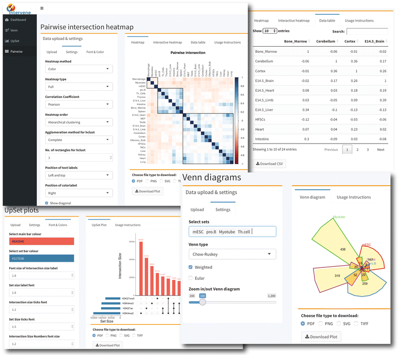
| style="background-color:white; padding-left:10px; padding-right:10px;"| <blockquote>'''Figure 3.''' Screenshots of web application user interface</blockquote> | |||
|- | |||
|} | |||
|} | |||
==References== | ==References== | ||
| Line 68: | Line 111: | ||
==Notes== | ==Notes== | ||
This presentation is faithful to the original, with only a few minor changes to presentation. In some cases important information was missing from the references, and that information was added | This presentation is faithful to the original, with only a few minor changes to presentation. In some cases important information was missing from the references, and that information was added. | ||
<!--Place all category tags here--> | <!--Place all category tags here--> | ||
Revision as of 01:50, 6 June 2017
| Full article title | Intervene: A tool for intersection and visualization of multiple gene or genomic region sets |
|---|---|
| Journal | BMC Bioinformatics |
| Author(s) | Khan, Aziz; Mathelier, Anthony |
| Author affiliation(s) | Centre for Molecular Medicine Norway, Norwegian Radium Hospital |
| Primary contact | Email: aziz dot khan at ncmm dot uio dot no and anthony dot mathelier at ncmm dot uio dot no |
| Year published | 2017 |
| Volume and issue | 18 |
| Page(s) | 287 |
| DOI | 10.1186/s12859-017-1708-7 |
| ISSN | 1471-2105 |
| Distribution license | Creative Commons Attribution 4.0 International |
| Website | https://bmcbioinformatics.biomedcentral.com/articles/10.1186/s12859-017-1708-7 |
| Download | https://bmcbioinformatics.biomedcentral.com/track/pdf/10.1186/s12859-017-1708-7 (PDF) |
Abstract
Background: A common task for scientists relies on comparing lists of genes or genomic regions derived from high-throughput sequencing experiments. While several tools exist to intersect and visualize sets of genes, similar tools dedicated to the visualization of genomic region sets are currently limited.
Results: To address this gap, we have developed the Intervene tool, which provides an easy and automated interface for the effective intersection and visualization of genomic region or list sets, thus facilitating their analysis and interpretation. Intervene contains three modules: venn to generate Venn diagrams of up to six sets, upset to generate UpSet plots of multiple sets, and pairwise to compute and visualize intersections of multiple sets as clustered heat maps. Intervene, and its interactive web ShinyApp companion, generate publication-quality figures for the interpretation of genomic region and list sets.
Conclusions: Intervene and its web application companion provide an easy command line and an interactive web interface to compute intersections of multiple genomic and list sets. They have the capacity to plot intersections using easy-to-interpret visual approaches. Intervene is developed and designed to meet the needs of both computer scientists and biologists. The source code is freely available at https://bitbucket.org/CBGR/intervene, with the web application available at https://asntech.shinyapps.io/intervene.
Keywords: visualization, Venn diagrams, UpSet plots, heat maps, genome analysis
Background
Effective visualization of transcriptomic, genomic, and epigenomic data generated by next-generation sequencing-based high-throughput assays have become an area of great interest. Most of the data sets generated by such assays are lists of genes or variants, and genomic region sets. The genomic region sets represent genomic locations for specific features, such as transcription factor – DNA interactions, transcription start sites, histone modifications, and DNase hypersensitivity sites. A common task in the interpretation of these features is to find similarities, differences, and enrichments between such sets, which come from different samples, experimental conditions, or cell and tissue types.
Classically, the intersection or overlap between different sets, such as gene lists, is represented by Venn diagrams[1] or Edwards-Venn.[2] If the number of sets exceeds four, such diagrams become complex and difficult to interpret. The key challenge is that there are 2n combinations to visually represent when considering n sets. An alternative approach, the UpSet plots, was introduced to depict the intersection of more than three sets.[3] The advantage of UpSet plots is their capacity to rank the intersections and alternatively hide combinations without intersection, which is not possible using a Venn diagram. However, with a large number of sets, UpSet plots become an ineffective way of illustrating set intersections. To visualize a large number of sets, one can represent pairwise intersections using a clustered heat map as suggested by Lex and Gehlenborg.[4]
There are several web applications and [[R (programming language)|R packages] available to compute intersection and visualization of up to six list sets by using Venn diagrams. Although tools exist to perform genomic region set intersections[5][6][7], there is a limited number of tools available to visualize them.[5][6] To our knowledge no tool exists to generate UpSet plots for genomic region sets. Consequently, there is a great need for integrative tools to compute and visualize intersection of multiple sets of both genomic regions and gene/list sets.
To address this need, we developed Intervene, an easy-to-use command line tool to compute and visualize intersections of genomic regions with Venn diagrams, UpSet plots, or clustered heat maps. Moreover, we provide an interactive web application companion to upload list sets or the output of Intervene to further customize plots.
Implementation
Intervene comes as a command line tool, along with an interactive Shiny web application to customize the visual representation of intersections. The command line tool is implemented in Python (version 2.7) and R programming language (version 3.3.2). The build also works with Python versions 3.4, 3.5, and 3.6. The accompanying web interface is developed using Shiny (version 1.0.0), a web application framework for R. Intervene uses pybedtools[6] to perform genomic region set intersections and Seaborn (https://seaborn.pydata.org/), Matplotlib[7], UpSetR[8], and Corrplot[9] to generate figures. The web application uses the R package Venerable[10] for different types of Venn diagrams, UpSetR for UpSet plots, and heatmap.2 and Corrplot for pairwise intersection clustered heat maps. The UpSet module of the web ShinyApp was derived from the UpSetR[8] ShinyApp, which was extended by adding more options and features to customize the UpSet plots.
Intervene can be installed by using pip install intervene or using the source code available on bitbucket https://bitbucket.org/CBGR/intervene. The tool has been tested on Linux and MAC systems. The Shiny web application is hosted with shinyapps.io by RStudio, and is compatible with all modern web browsers. A detailed documentation including installation instructions and how to use the tool is provided in Additional file 1 and is available at http://intervene.readthedocs.io.
Results
An integrated tool for effective visualization of multiple set intersections
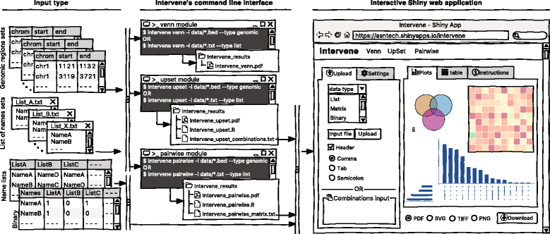
As visualization of sets and their intersections is becoming more and more challenging due to the increasing number of generated data sets, there is a strong need to have an integrated tool to compute and visualize intersections effectively. To address this challenge, we have developed Intervene, which is composed of three different modules, accessible through the subcommands venn, upset, and pairwise. Intervene accepts two types of input files: genomic regions in BED, GFF, or VCF format and gene/name lists in plain text format. A detailed sketch of Intervene’s command line interface and web application utility with types of inputs is provided in Fig. 1.
|
Intervene provides flexibility to the user to choose figure colors, label text, size, resolution, and type to make them publication-standard quality. To read the help about any module, the user can type intervene < subcommand > −-help on the command line. Furthermore, Intervene produces results as text files, which can be easily imported to the web application for interactive visualization and customization of plots (see “An interactive web application” section).
Venn diagrams module
Venn diagrams are the classical approach to show intersections between sets. There are several web-based applications and R packages available to visualize intersections of up-to six list sets in classical Venn, Euler, or Edward’s diagrams.[11][12][13][14][15][16] However, a very limited number of tools are available to visualize genomic region intersections using classical Venn diagrams.[5][6]
Intervene provides up-to six-way classical Venn diagrams for gene lists or genomic region sets. The associated web interface can also be used to compute the intersection of multiple gene sets and visualize it using different flavors of weighted and unweighted Venn and Euler diagrams. These different types include: classical Venn diagrams (up-to five sets), Chow-Ruskey (up-to five sets), Edwards’ diagrams (up-to five sets), and Battle (up-to nine sets).
As an example, one might be interested to calculate the number of overlapping ChIP-seq (chromatin immunoprecipitation followed by sequencing) peaks between different types of histone modification marks (H3K27ac, H3K4me3, and H3K27me3) in human embryonic stem cells (hESC)[17] (Fig. 2a , can be generated with the command intervene venn --test).
|
UpSet plots module
When the number of sets exceeds four, Venn diagrams become difficult to read and interpret. An alternative and more effective approach is to use UpSet plots to visualize the intersections. An R package with a ShinyApp (https://gehlenborglab.shinyapps.io/upsetr/) and an interactive web-based tool are available at http://vcg.github.io/upset to visualize multiple list sets. However, to our knowledge, there is no tool available to draw the UpSet plots for genomic region set intersections. Intervene’s upset subcommand can be used to visualize the intersection of multiple genomic region sets using UpSet plots.
As an example, we show the intersections of ChIP-seq peaks for histone modifications (H3K27ac, H3K4me3, H3K27me3, and H3K4me2) in hESC using an UpSet plot, where interactions were ranked by frequency (Fig. 2b, can be generated with the command intervene upset --test). This plot is easier to understand than the four-way Venn diagram (Additional file 1).
Pairwise intersection heat maps module
With an increasing number of data sets, visualizing all possible intersections becomes unfeasible by using Venn diagrams or UpSet plots. One possibility is to compute pairwise intersections and plot-associated metrics as a clustered heat map. Intervene’s pairwise module provides several metrics to assess intersections, including number of overlaps, fraction of overlap, Jaccard statistics, Fisher’s exact test, and distribution of relative distances. Moreover, the user can choose from different styles of heat maps and clustering approaches.
As an example, we obtained the genomic regions of super enhancers in 24 mouse cell type and tissues from dbSUPER[18] and computed the pairwise intersections in terms of Jaccard statistics (Fig. 2c). The triangular heat map shows the pairwise Jaccard index, which is between 0 and 1, where 0 means no overlap and 1 means full overlap. The bar plot shows the number of regions in each cell-type or tissue. This plot can be generated using the command intervene pairwise --test).
An interactive web application
Intervene comes with a web application companion to further explore and filter the results in an interactive way. Indeed, intersections between large data sets can be computed locally using Intervene’s command line interface, then the output files can be uploaded to the ShinyApp for further exploration and customization of the figures (Fig. 1 ).
The ShinyApp web interface takes four types of inputs: (i) a text/csv file where each column represents a set, (ii) a binary representation of intersections, (iii) a pairwise matrix of intersections, and (iv) a matrix of overlap counts. The web application provides several easy and intuitive customization options for responsive adjustments of the figures (Figs. 1 and 3). Users can change colors, fonts and plot sizes, change labels, and select and deselect specific sets. These customized and publication-ready figures can be downloaded in PDF, SVG, TIFF, and PNG formats. The pairwise modules also provides three types of correlation coefficients and hierarchical clustering with eight clustering methods and four distance measurement methods. It further provides interactive features to explore data values; this is done by hovering the mouse cursor over each heat map cell, or by using a searchable and sortable data table. The data table can be downloaded as a CSV file and interactive heat maps can be downloaded as HTML. The Shiny-based web application is freely available at https://asntech.shinyapps.io/intervene.
|
References
- ↑ Venn, J. (1880). "On the diagrammatic and mechanical representation of propositions and reasonings". Philisophical Magazine and Journal of Science 10 (59): 1–18. doi:10.1080/14786448008626877.
- ↑ Edwards, A.W.F. (2004). Cogwheels of the Mind: The Story of Venn Diagrams. Johns Hopkins University Press. pp. 128. ISBN 9780801874345.
- ↑ Lex, A.; Gehlenborg, N.; Strobelt, H. et al. (2014). "UpSet: Visualization of Intersecting Sets". IEEE Transactions on Visualization and Computer Graphics 20 (12): 1983-92. doi:10.1109/TVCG.2014.2346248.
- ↑ Lex, A.; Gehlenborg, N. (2014). "Points of view: Sets and intersections". IEEE Transactions on Visualization and Computer Graphics 11: 779. doi:10.1038/nmeth.3033.
- ↑ 5.0 5.1 5.2 Zhu, L.J.; Gazin, C.; Lawson, N.D. et al. (2010). "ChIPpeakAnno: A Bioconductor package to annotate ChIP-seq and ChIP-chip data". BMC Bioinformatics 11: 237. doi:10.1186/1471-2105-11-237. PMC PMC3098059. PMID 20459804. https://www.ncbi.nlm.nih.gov/pmc/articles/PMC3098059.
- ↑ 6.0 6.1 6.2 6.3 Dale, R.K.; Pedersen, B.S.; Quinlan, A.R. (2011). "Pybedtools: A flexible Python library for manipulating genomic datasets and annotations". Bioinformatics 27 (24): 3423–4. doi:10.1093/bioinformatics/btr539. PMC PMC3232365. PMID 21949271. https://www.ncbi.nlm.nih.gov/pmc/articles/PMC3232365.
- ↑ 7.0 7.1 Hunter, J.D. (2007). "Matplotlib: A 2D Graphics Environment". Computing in Science & Engineering 9 (3). doi:10.1109/MCSE.2007.55.
- ↑ 8.0 8.1 Conway, J.R.; Lex, A.; Gehlenborg, N. (25 March 2017). "UpSetR: An R Package For The Visualization Of Intersecting Sets And Their Properties". bioRxiv. doi:10.1101/120600.
- ↑ Wei, T.; Simko, V. (21 April 2016). "corrplot: Visualization of a Correlation Matrix". https://cran.r-project.org/package=corrplot.
- ↑ Swinton, J. (23 September 2009). "Venn diagrams in R with Vennerable package". https://r-forge.r-project.org/scm/viewvc.php/*checkout*/pkg/Vennerable/inst/doc/Venn.pdf?revision=58&root=vennerable.
- ↑ 11.0 11.1 Hulsen, T.; de Vlieg, J.; Alkema, W. (2008). "BioVenn - A web application for the comparison and visualization of biological lists using area-proportional Venn diagrams". BMC Genomics 9: 488. doi:10.1186/1471-2164-9-488. PMC PMC2584113. PMID 18925949. https://www.ncbi.nlm.nih.gov/pmc/articles/PMC2584113.
- ↑ Lam, F.; Lalansingh, C.M.; Babaran, H.E. (2016). "VennDiagramWeb: A web application for the generation of highly customizable Venn and Euler diagrams". BMC Bioinformatics 17 (1): 401. doi:10.1186/s12859-016-1281-5. PMC PMC5048655. PMID 27716034. https://www.ncbi.nlm.nih.gov/pmc/articles/PMC5048655.
- ↑ Bardou, P.; Mariette, J.; Escudié, F. et al. (2014). "jvenn: An interactive Venn diagram viewer". BMC Bioinformatics 15: 293. doi:10.1186/1471-2105-15-293. PMC PMC4261873. PMID 25176396. https://www.ncbi.nlm.nih.gov/pmc/articles/PMC4261873.
- ↑ Lin, G.; Chai, J.; Yuan, S. et al. (2016). "VennPainter: A Tool for the Comparison and Identification of Candidate Genes Based on Venn Diagrams". PLoS One 11 (4): e0154315. doi:10.1371/journal.pone.0154315. PMC PMC4847855. PMID 27120465. https://www.ncbi.nlm.nih.gov/pmc/articles/PMC4847855.
- ↑ Martin, B.; Chadwick, W.; Yi, T. et al. (2012). "VENNTURE--A novel Venn diagram investigational tool for multiple pharmacological dataset analysis". PLoS One 7 (5): e36911. doi:10.1371/journal.pone.0036911. PMC PMC3351456. PMID 22606307. https://www.ncbi.nlm.nih.gov/pmc/articles/PMC3351456.
- ↑ Heberle, H.; Meirelles, G.V.; da Silva, F.R. et al. (2015). "InteractiVenn: A web-based tool for the analysis of sets through Venn diagrams". BMC Bioinformatics 16: 169. doi:10.1186/s12859-015-0611-3. PMC PMC4455604. PMID 25994840. https://www.ncbi.nlm.nih.gov/pmc/articles/PMC4455604.
- ↑ Dunham, I.; Kundaje, A.; Aldred, S.F. et al. (2012). "An integrated encyclopedia of DNA elements in the human genome". Nature 489: 7414. doi:10.1038/nature11247. PMC PMC3439153. PMID 22955616. https://www.ncbi.nlm.nih.gov/pmc/articles/PMC3439153.
- ↑ Khan, A.; Zhang, X. (2016). "dbSUPER: a database of super-enhancers in mouse and human genome". Nucleic Acids Research 44 (D1): D164-71. doi:10.1093/nar/gkv1002. PMC PMC4702767. PMID 26438538. https://www.ncbi.nlm.nih.gov/pmc/articles/PMC4702767.
Notes
This presentation is faithful to the original, with only a few minor changes to presentation. In some cases important information was missing from the references, and that information was added.
