Difference between revisions of "Journal:Timely delivery of laboratory efficiency information, Part II: Assessing the impact of a turnaround time dashboard at a high-volume laboratory"
Shawndouglas (talk | contribs) (Saving and adding more.) |
Shawndouglas (talk | contribs) (Saving and adding more.) |
||
| Line 94: | Line 94: | ||
==Results== | ==Results== | ||
This laboratory performed 326,081 tests for the 2016/2017 financial period, 341,760 tests for the 2017/2018 financial period, and 399,538 tests for the 2018/2019 financial period. Assuming 24/7 operations, this equates to between 894 and 1,095 tests per day (N. Booplal, 2019, personal communication). Prior to the implementation of the interactive dashboard, weekly TAT data were extracted from the corporate [[data warehouse]] that houses LIS data within the National Health Laboratory Service. Weekly Microsoft Excel worksheets were prepared manually and distributed via email prior to the implementation of the interactive dashboard at week 45. | This laboratory performed 326,081 tests for the 2016/2017 financial period, 341,760 tests for the 2017/2018 financial period, and 399,538 tests for the 2018/2019 financial period. Assuming 24/7 operations, this equates to between 894 and 1,095 tests per day (N. Booplal, 2019, personal communication). Prior to the implementation of the interactive dashboard, weekly TAT data were extracted from the corporate [[data warehouse]] that houses LIS data within the National Health Laboratory Service. Weekly Microsoft Excel worksheets were prepared manually and distributed via email prior to the implementation of the interactive dashboard at week 45. | ||
===Percentage of within cutoff turnaround time analysis=== | |||
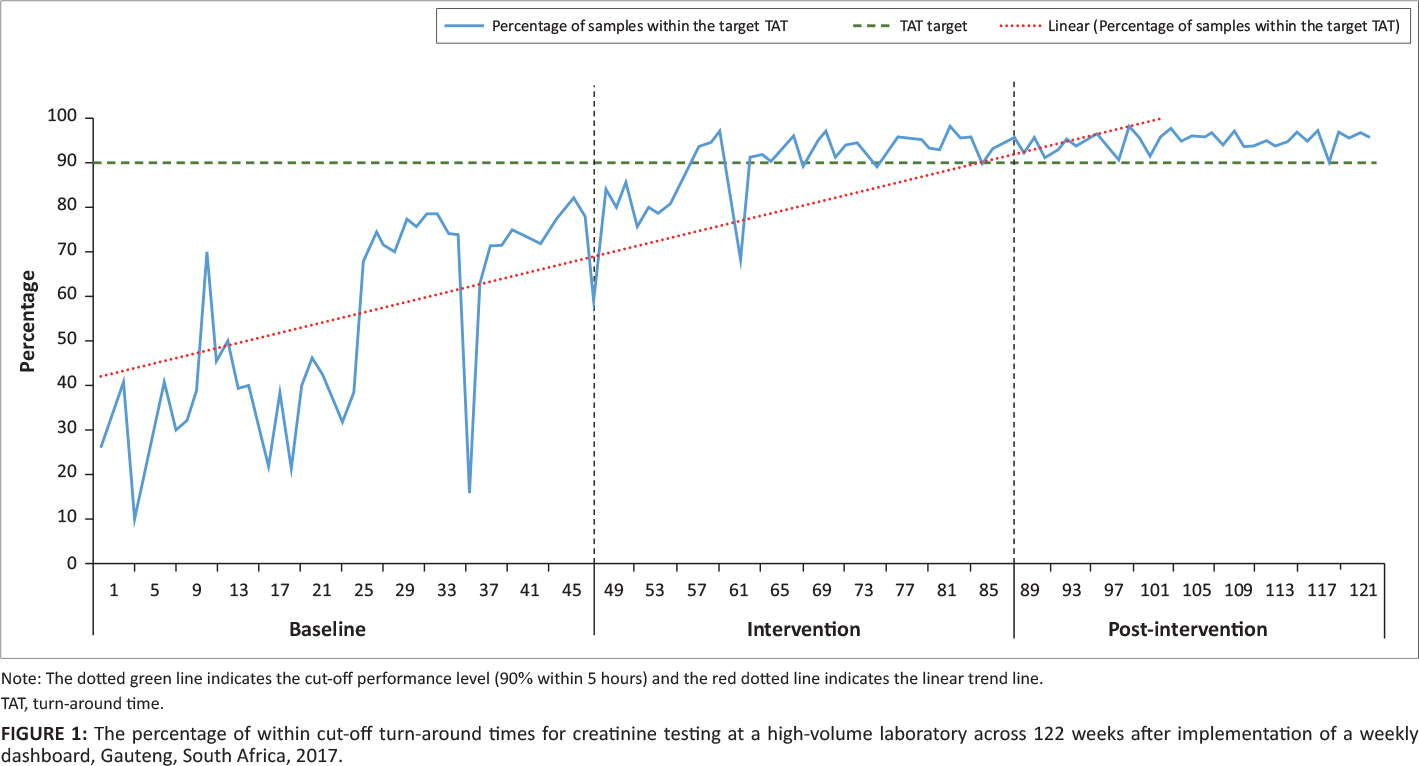
For the baseline phase, the percentage of TAT within the cutoff fluctuated (range: 10% to 79%) (Figure 1). During the intervention, the TAT range again fluctuated from 59% to 97%. For the post-intervention phase, the percentage of TAT with the cutoff ranged from 89% to 98%. The 90% cut-off was met for 42 consecutive weeks from week 81 to the end of the study period. | |||
[[File:Fig1 Cassim AfricanJLabMed2020 9-2-b.jpg|1100px]] | |||
{{clear}} | |||
{| | |||
| STYLE="vertical-align:top;"| | |||
{| border="0" cellpadding="5" cellspacing="0" width="1100px" | |||
|- | |||
| style="background-color:white; padding-left:10px; padding-right:10px;"| <blockquote>'''Fig. 1.''' The percentage of within cut-off turn-around times for creatinine testing at a high-volume laboratory across 122 weeks after implementation of a weekly dashboard, Gauteng, South Africa, 2017</blockquote> | |||
|- | |||
|} | |||
|} | |||
===75th percentile turnaround time analysis=== | |||
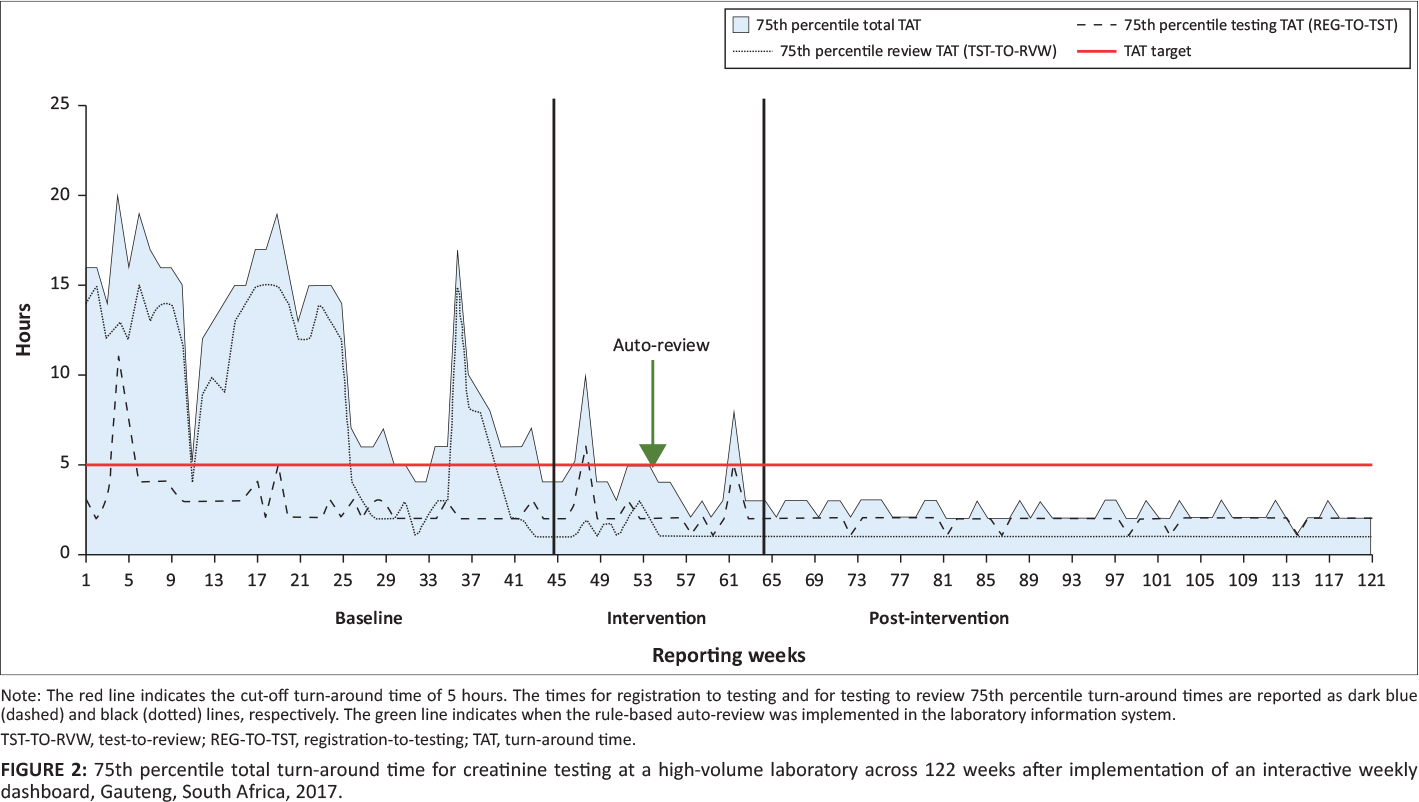
During the baseline phase, the total TAT 75th percentile ranged from four to 20 hours, changing to two to 10 hours for the intervention phase (Figure 2). For the post-intervention phase, the 75th percentile range was two to three hours. For testing TAT, the 75th percentile for the baseline phase ranged from two to 11 hours and changed during the intervention phase to one to six hours. In the post-intervention phase, the range was one to two hours. In the baseline phase, the 75th percentile review TAT ranged from one to 15 hours, compared to one to three hours for the intervention phase. The post-intervention phase reported a 75th percentile review TAT of one hour or less. | |||
[[File:Fig2 Cassim AfricanJLabMed2020 9-2-b.jpg|1100px]] | |||
{{clear}} | |||
{| | |||
| STYLE="vertical-align:top;"| | |||
{| border="0" cellpadding="5" cellspacing="0" width="1100px" | |||
|- | |||
| style="background-color:white; padding-left:10px; padding-right:10px;"| <blockquote>'''Fig. 2.''' 75th percentile total turn-around time for creatinine testing at a high-volume laboratory across 122 weeks after implementation of an interactive weekly dashboard, Gauteng, South Africa, 2017</blockquote> | |||
|- | |||
|} | |||
|} | |||
===Root cause analysis=== | |||
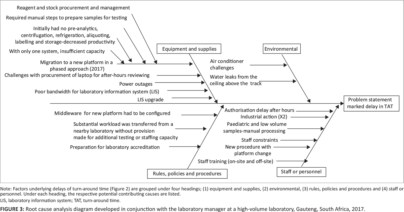
Four major clusters of contributing causes were identified in the root cause analysis, including equipment and supplies; environmental causes; rules, policies, and procedural causes; and staff and personnel factors (Figure 3). | |||
With respect to equipment and supplies, the following causes were shown to have negatively impacted TAT: (1) migration to the new platform (phased approach), (2) difficulties with procurement of laptops to facilitate after-hours off-site authorization, (3) power outages, (4) LIS bandwidth challenges, (5) LIS upgrades, and (6) reagent or stock procurement. | |||
Insufficient air conditioning and water leaks from the ceiling were highlighted as causative environmental factors. | |||
Problems related to rules, policies, and procedures included (1) middleware having to be configured, tested, and amended due to the changes brought about by a phased approach, and (2) a substantial workload being transferred from a nearby laboratory without provision of additional testing or staffing capacity. | |||
For staff and personnel considerations, the following were identified: (1) after-hours authorization delay (by pathologists); (2) industrial action leading to delays; (3) paediatric and low-volume samples requiring manual processing, causing bottlenecks in the workflow; (4) staff constraints (in terms of insufficient staff to manage the benches); (5) additional training of staff being required for new procedures and processes for the platform testing changes implemented; (6) first-line manual sample preparation being needed to enable sample testing prior to full automation; and (7) training for the new platforms provided occurring on-site, while at the same time staff were also required to attend training off-site, leaving benches poorly staffed during training periods. | |||
[[File:Fig3 Cassim AfricanJLabMed2020 9-2-b.jpg|1100px]] | |||
{{clear}} | |||
{| | |||
| STYLE="vertical-align:top;"| | |||
{| border="0" cellpadding="5" cellspacing="0" width="1100px" | |||
|- | |||
| style="background-color:white; padding-left:10px; padding-right:10px;"| <blockquote>'''Fig. 3.''' Root cause analysis diagram developed in conjunction with the laboratory manager at a high-volume laboratory, Gauteng, South Africa, 2017</blockquote> | |||
|- | |||
|} | |||
|} | |||
==Discussion== | |||
Revision as of 18:37, 24 January 2021
| Full article title | Timely delivery of laboratory efficiency information, Part II: Assessing the impact of a turnaround time dashboard at a high-volume laboratory |
|---|---|
| Journal | African Journal of Laboratory Medicine |
| Author(s) | Cassim, Naseem; Coetzee, Lindi M.; Tepper, Manfred E.; Perelson, Louella; Glencross, Deborah K. |
| Author affiliation(s) | National Health Laboratory Service, University of the Witwatersrand |
| Primary contact | Email: naseem dot cassim at wits dot ac dot za |
| Year published | 2020 |
| Volume and issue | 9(2) |
| Article # | a948 |
| DOI | 10.4102/ajlm.v9i2.948 |
| ISSN | 2225-2010 |
| Distribution license | Creative Commons Attribution 4.0 International License |
| Website | https://ajlmonline.org/index.php/ajlm/article/view/948/1475 |
| Download | https://ajlmonline.org/index.php/ajlm/article/download/948/1473 (PDF) |
|
|
This article should be considered a work in progress and incomplete. Consider this article incomplete until this notice is removed. |
Abstract
Background: In South Africa’s National Health Laboratory Service, ad hoc mean turnaround time (TAT) reporting is an important indicator of performance. However, historic static TAT reporting did not assess very long or very short times. An interactive TAT dashboard was developed using the following TAT measures: (1) median, (2) 75th percentile, and (3) percentage of within cutoff TAT to allow for improved differentiation of TAT performance.
Objectives: The objective of our study was to demonstrate increased efficiency achieved by using an interactive TAT dashboard.
Methods: A retrospective descriptive study design was used. Creatinine TAT outcomes were reported over 122 weeks from a high-volume laboratory in Gauteng, South Africa. The percentage of within cutoff and 75th percentile TAT were analyzed and reported using Microsoft Excel. A focus group session was used to populate a cause and effect diagram.
Results: The percentage of within cutoff TAT increased from 10% in week four to 90% and higher from week 81. The 75th percentile decreased from 10 hours in week four to under five hours from week 71. Component TAT analysis revealed that the 75th percentile testing was five hours or longer for weeks four, five and 48. The 75th percentile review TAT ranged from one hour to 15 hours. From week 41, the review TAT was under one hour.
Conclusion: Our study demonstrated that the use of an interactive TAT dashboard, coupled with good management, can dramatically improve TAT and efficiency in a high-volume laboratory.
Keywords: turnaround time, laboratory efficiency, pathology, laboratory medicine
Introduction
Turnaround time (TAT) is an important performance indicator of a laboratory's efficiency in delivering patient results.[1] In the South African National Health Laboratory Services, ad hoc mean TAT reports were previously produced for laboratory managers. These TAT reports assessed performance based on the National Health Laboratory Service global annual performance plan (APP) TAT cutoffs specific to individual tests.[2] Reports were provided intermittently in a static form that assessed central tendency only (i.e., the tail size was not reported) and did not allow for drilling down to access additional, more detailed information to direct meaningful corrective action (i.e., laboratory or sample-level TAT breakdown). To improve on these TAT reporting systems, Coetzee et al. used three additional measures to assess TAT efficiency: (1) median TAT, (2) 75th percentile TAT (tail size), and (3) percentage of within cutoff TAT.[3] These measures accurately assessed outliers as tail size and could be used by laboratories to address workflow issues and identify testing delays for intervention. "Tail size" refers to the volume of samples in a positively skewed data distribution that has a long tail to the right. These samples often have a much higher TAT value than the central tendency (median) for this data distribution. Tail size can be measured as the percentage of samples that exceed a defined TAT cutoff in hours, or as a percentile.
Initially, the three measures described above were reported in Microsoft Excel (Redmond, Washington, United States) worksheet format from August 2016 to June 2017.[4] Thereafter, from July 2017, an interactive dashboard was developed that reported TAT data for a basket of tests using the Microstrategy Desktop (Tysons, Virginia, United States) analytics tool.[5] The previous static reports and the more recent interactive dashboard reports have seen distribution to area (province), business (district), and laboratory managers. Data can now be reviewed in the interactive dashboard reports across the provincial, district or laboratory levels through drill-down functionality, which makes it possible to slice through a data hierarchy to reveal additional details[6] contained within the aggregated data. In this way, TAT data presented can be visualized at the national, provincial, and laboratory level on the same dashboard page. The approach allows various levels of manager to drill down from a "bird’s-eye" view of TAT performance nationally, down to the provincial or individual laboratory level.
Within the dashboard, TAT can be viewed for a basket of tests, including:
- routine hematology such as full blood count with platelet and differential testing, international normalized ratio, activated prothrombin testing, and D-dimers;
- clinical pathology testing such as urea and electrolytes, liver function testing, glucose, and cholesterol;
- microbiology testing such as HIV (HIV viral load, HIV DNA polymerase chain reaction), tuberculosis (Xpert MTB/RIF), and syphilis (rapid plasma reagin and Treponema pallidum antibodies); and
- other disease testing methods such as cluster of differentiation 4 (CD4) testing.
Proxy marker analytes are used to assess performance of the respective matched assay panel; for example, creatinine is used as the proxy test to review urea and electrolytes performance. Each test has its own predetermined TAT determined at the local level according to the level of care, with absolute national APP cutoffs noted.
Global TAT outcomes for each test are reported according to specifically stipulated, organization-determined TAT APP at the national level and are described elsewhere.[2][7] National APP cutoffs are set bearing in mind the multi-tiered service that accommodates reporting from primary health care referral to large tertiary centers that may offer emergency services, and do not necessarily reflect the respective individual, laboratory-stipulated TAT, which may be self-determined by laboratories based on their local clinical needs.
Armed with the knowledge of TAT and which tests are identified as poor performers in the interactive dashboard, laboratory managers can identify and address areas of concern through review of the contributing causes.[8] This is achieved through root cause analysis, a method of problem solving used to identify the root causes (faults or problems) and determine the most probable underlying causes of error.[8] The ultimate aim of root cause analysis in TAT monitoring is to formulate corrective actions that either mitigate or eliminate the identified causes in order to return TAT efficiency and performance to acceptable levels.
The aim of this study was to report on the impact of an interactive dashboard that provides weekly information about TAT and enables laboratory and senior managers to monitor TAT, as well as identify problematic areas for corrective action. The hypothesis was that an interactive TAT dashboard delivering week-by-week information about laboratory TAT provides the impetus for continuous service review and implementation of appropriate corrective action, where required, to ensure the timeliness of laboratory reporting. Data are presented from a single busy, routinely automated clinical pathology laboratory at a large regional hospital to reveal how the described TAT dashboard served to continually highlight ongoing TAT delays for urea and electrolyte (creatinine) result reporting and, ultimately, facilitated sustained corrective action.
Methods
Ethical considerations
Ethics clearance was obtained from the University of the Witwatersrand (study approval number: M1706108). No patient identifiers were extracted with data.
Study design and samples used
A retrospective descriptive study design was used to analyze laboratory data and highlight the impact of interventions by observing trends. Qualitative focus group sessions were used to unpack the root causes of poor performance. Convenience sampling was used. For the purpose of this study, the TAT performance for creatinine testing, which had poor TAT at the start of the study, was used to demonstrate how dashboard monitoring of TAT could highlight and impact the TAT. Creatinine testing outcomes were reported with an APP cutoff of 90% within five hours.[2] Weekly TAT data—from the week August 1, 2016 to August 7, 2016 (week one), through to the week November 26, 2018 to December 2, 2018 (week 122)—was reviewed.
Data extraction and turnaround time definition
The data extract contained the following variables:
- report week ending date, e.g., October 23, 2016 (Monday to Sunday)
- laboratory name
- test method name
- TAT cutoff
- test volumes
- percentage of within cutoff TAT
- median TAT
- 75th percentile TAT
- inter-laboratory referral 75th percentile TAT
- testing 75th percentile TAT
- review 75th percentile TAT
All TAT 75th percentile values were reported in hours. Each week was numbered, that is, 1–122. TAT data refer to total TAT (i.e., time of first registration to time of result release after review) if not otherwise specified for TAT components. All data were prepared and analyzed using Microsoft Excel (Redmond, Washington, United States).[4] The testing TAT time interval was calculated from time of registration in the testing laboratory to time of result generation on the analyzer interface. Review TAT (labeled TST-TO-RVW [test-to-review]) is the time taken by a senior technologist to review the patients’ results on the laboratory information system (LIS), making sure all quality checks were adequately performed before releasing (authorizing) the patients report. The recorded time interval, that is, the review TAT, was calculated afterwards for each individual sample outcome, from the time of result generation to the time of authorization or review.
Percentage within cutoff turnaround time analysis
The percentage of within cutoff TAT was calculated as the total number of samples meeting the organization’s TAT cutoff criteria of five hours for urea and electrolytes testing divided by the total number of tests performed, expressed as a percentage, per week. The results were reported as a line chart (indicating the week number and APP cutoff of 90%). Data were segmented into three phases: (1) baseline: week 1 to 44 (week ending June 4, 2017); (2) dashboard intervention: week 45 to 63 (week ending October 15, 2017); and (3) post-intervention from week 64 to 122 (week ending December 2, 2018). The dashboard intervention period indicates the switch from using an Excel worksheet to the interactive dashboard.
75th percentile turnaround time analysis
The 75th percentile was calculated for total TAT per week, as well as for TAT components, that is, testing and review. As tests were based out of a local hospital and not referred from surrounding laboratories, the pre-analytical TAT component was not applicable. When samples are referred, the pre-analytical TAT measures the interval (time taken to transport the sample between laboratories) from registration at the source (the laboratory where the sample was received) to the testing laboratory. Results from this analysis were plotted as 75th percentile, per testing week, for both total and component TAT.
Root cause analysis
A root cause or Ishikawa analysis diagram was used to identify potential factors causing poor TAT performance.[9] Causes were grouped into the following headings: (1) equipment and supplies; (2) environmental; (3) rules, policies, or procedures; and (4) staff or personnel. Focus group meetings were arranged with the laboratory manager and section supervisors to identify causes and to populate the cause-and-effect diagram. A voice recorder was used to create the cause-and-effect diagram using Microsoft Visio (Redmond, Washington, United States).[4]
Results
This laboratory performed 326,081 tests for the 2016/2017 financial period, 341,760 tests for the 2017/2018 financial period, and 399,538 tests for the 2018/2019 financial period. Assuming 24/7 operations, this equates to between 894 and 1,095 tests per day (N. Booplal, 2019, personal communication). Prior to the implementation of the interactive dashboard, weekly TAT data were extracted from the corporate data warehouse that houses LIS data within the National Health Laboratory Service. Weekly Microsoft Excel worksheets were prepared manually and distributed via email prior to the implementation of the interactive dashboard at week 45.
Percentage of within cutoff turnaround time analysis
For the baseline phase, the percentage of TAT within the cutoff fluctuated (range: 10% to 79%) (Figure 1). During the intervention, the TAT range again fluctuated from 59% to 97%. For the post-intervention phase, the percentage of TAT with the cutoff ranged from 89% to 98%. The 90% cut-off was met for 42 consecutive weeks from week 81 to the end of the study period.
|
75th percentile turnaround time analysis
During the baseline phase, the total TAT 75th percentile ranged from four to 20 hours, changing to two to 10 hours for the intervention phase (Figure 2). For the post-intervention phase, the 75th percentile range was two to three hours. For testing TAT, the 75th percentile for the baseline phase ranged from two to 11 hours and changed during the intervention phase to one to six hours. In the post-intervention phase, the range was one to two hours. In the baseline phase, the 75th percentile review TAT ranged from one to 15 hours, compared to one to three hours for the intervention phase. The post-intervention phase reported a 75th percentile review TAT of one hour or less.
|
Root cause analysis
Four major clusters of contributing causes were identified in the root cause analysis, including equipment and supplies; environmental causes; rules, policies, and procedural causes; and staff and personnel factors (Figure 3).
With respect to equipment and supplies, the following causes were shown to have negatively impacted TAT: (1) migration to the new platform (phased approach), (2) difficulties with procurement of laptops to facilitate after-hours off-site authorization, (3) power outages, (4) LIS bandwidth challenges, (5) LIS upgrades, and (6) reagent or stock procurement.
Insufficient air conditioning and water leaks from the ceiling were highlighted as causative environmental factors.
Problems related to rules, policies, and procedures included (1) middleware having to be configured, tested, and amended due to the changes brought about by a phased approach, and (2) a substantial workload being transferred from a nearby laboratory without provision of additional testing or staffing capacity.
For staff and personnel considerations, the following were identified: (1) after-hours authorization delay (by pathologists); (2) industrial action leading to delays; (3) paediatric and low-volume samples requiring manual processing, causing bottlenecks in the workflow; (4) staff constraints (in terms of insufficient staff to manage the benches); (5) additional training of staff being required for new procedures and processes for the platform testing changes implemented; (6) first-line manual sample preparation being needed to enable sample testing prior to full automation; and (7) training for the new platforms provided occurring on-site, while at the same time staff were also required to attend training off-site, leaving benches poorly staffed during training periods.
|
Discussion
References
- ↑ Hawkins, R.C. (2007). "Laboratory turnaround time". The Clinical Biochemist 28 (4): 179–94. PMC PMC2282400. PMID 18392122. https://www.ncbi.nlm.nih.gov/pmc/articles/PMC2282400.
- ↑ 2.0 2.1 2.2 National Health Laboratory Service (2018) (PDF). National Health Laboratory Service Annual Report 2017/18. National Health Laboratory Service. ISBN 9780621457018. https://nationalgovernment.co.za/entity_annual/1714/2018-national-health-laboratory-service-(nhls)-annual-report.pdf.
- ↑ Coetzee, L.M.; Cassim, N.; Tepper, M.E.E. et al. (2018). "The importance of reporting individual weekly laboratory turn-around-time (TAT) to identify outliers and underperformance masked during global annual TAT review". Proceedings of the African Society for Laboratory Medicine Conference 2018. https://www.researchgate.net/publication/329610644. "Poster ID: PS-2.3b-070"
- ↑ 4.0 4.1 4.2 "Apps and services". Microsoft. https://www.microsoft.com/en-za/microsoft-365/products-apps-services. Retrieved 12 March 2019.
- ↑ "Download MicroStrategy Desktop". MicroStrategy. https://www.microstrategy.com/en/get-started/desktop. Retrieved 03 December 2018.
- ↑ Microsoft. "Drill mode in a visual in Power BI". https://docs.microsoft.com/en-us/power-bi/consumer/end-user-drill. Retrieved 12 December 2018.
- ↑ Cassim, N.; Tepper, M.E.; Coetzee, L.M.; Glencross, D.K. (2020). "Timely delivery of laboratory efficiency information, Part I: Developing an interactive turnaround time dashboard at a high-volume laboratory". African Journal of Laboratory Medicine 9 (2): a947. doi:10.4102/ajlm.v9i2.947. PMC PMC7203318. PMID 32391244. https://www.ncbi.nlm.nih.gov/pmc/articles/PMC7203318.
- ↑ 8.0 8.1 Khan, K.. "Root Cause Analysis (RCA) of Prolonged Laboratory Turnaround Time in a Tertiary Care Set Up". Journal of Clinical and Diagnostic Research 8 (4): FC05–FC08. doi:10.7860/JCDR/2014/7269.4255. PMC PMC4064846. PMID 24959450. https://www.ncbi.nlm.nih.gov/pmc/articles/PMC4064846.
- ↑ Ishikawa, K. (1976). Guide to Quality Control (2nd Revised ed.). Asian Productivity Organization. ISBN 9283310365. https://archive.org/details/guidetoqualityco00ishi/page/n7/mode/2up.
Notes
This presentation is faithful to the original, with only a few minor changes to presentation. Grammar was cleaned up for smoother reading. In some cases important information was missing from the references, and that information was added. The original citation number two (2017-2018 NHLS Annual Report) was dead; an alternately hosted version was found and used for this version. The original cites Wikipedia concerning the Ishikawa diagram; as using Wikipedia as a citation is generally frowned upon, a substitute citation for Ishikawa's original Guide to Quality Control was used for this version.
